Variable Control Charts: The Complete Guide to Process Monitoring and Control
Understanding how to effectively use a Variable Control Chart is fundamental to modern Statistical Process Control (SPC).
Unlike attribute charts that track count data (like defect numbers), variable charts offer deeper insights into process performance by analyzing actual measurements.
The concept originated in the 1920s when Walter Shewhart, a physicist and engineer at Bell Laboratories, developed the first control chart.
Build Your Foundational Knowledge of Quality Improvement?
Gain the working knowledge and essential tools needed with Lean Six Sigma Green Belt Certification.

You will learn how to:
- Monitor process stability effectively.
- Identify special cause variation quickly.
- Make data-driven improvement decisions.
- Reduce waste and rework costs.
- Understand process behavior clearly.
What Is a Variable Control Chart?
A variable control chart is a statistical tool used to monitor and control processes that produce measurable, continuous data.
These charts plot data points over time, allowing quality professionals to visualize process performance and detect when a process might be shifting out of control.
Unlike other quality tools that provide snapshots of performance, variable control charts track the process behavior continuously, making them essential for maintaining consistent quality.
The primary purpose of these charts is to distinguish between common cause variation (natural, expected variation inherent in any process) and special cause variation (unusual patterns indicating something in the process has changed).
This distinction helps teams avoid two costly mistakes: reacting to random variation as if it were significant or missing actual problems that require attention.
Definition and Purpose
Variable control charts, also known as Shewhart charts after their inventor Walter Shewhart, specifically monitor continuous measurement data—things you can measure on a scale, like dimensions, weight, temperature, or time.
These charts plot individual measurements or statistical summaries of sample groups against time.
The key difference between variable control charts and attribute control charts lies in the type of data they track.
Variable control charts work with continuous measurement data (how much, how many, how long), while attribute charts handle discrete, countable data (good/bad, pass/fail, present/absent). For example:
- A variable control chart might track the actual diameter measurements of machined parts (29.97mm, 30.02mm, 29.98mm)
- An attribute chart would simply count how many parts fall outside acceptable limits
This distinction makes variable control charts more sensitive to process changes and typically requires smaller sample sizes to detect shifts.
They provide richer information about process performance, allowing for more precise control and improvement efforts.
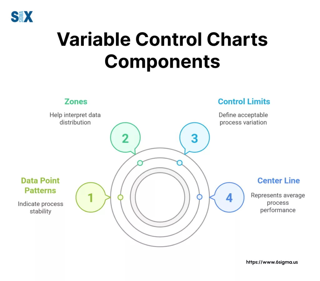
Basic Components
Every variable control chart contains three fundamental elements that make interpretation possible:
The Center Line represents the process average or target value. This line serves as the reference point for normal process performance.
In a Shewhart chart, this is typically the mean of all sample means or individual values.
The Upper Control Limit (UCL) defines the upper boundary of expected variation. Values above this line suggest special cause variation that requires investigation.
The UCL is typically set at three standard deviations above the center line, capturing 99.73% of expected variation in a stable process.
The Lower Control Limit (LCL) marks the lower boundary of expected variation. Points falling below this line also indicate potential special causes affecting the process.
Like the UCL, the LCL is usually positioned three standard deviations below the center line.
Together, these three elements create a visual framework that makes process behavior immediately apparent.
When data points stay within the control limits and show random patterns, the process is considered “in control.” When points fall outside limits or display non-random patterns, it signals that something in the process has changed.
Root Cause Analysis complements control charts by providing structured methods to investigate the sources of special cause variation detected on your charts.
Types of Variable Control Charts
Selecting the right chart depends on your sampling method, data characteristics, and what you’re trying to detect.
Variables control charts fall into two main categories: those designed for subgrouped data and those for individual measurements.
Sub-grouped Data Charts
Sub-grouped data charts monitor processes where multiple measurements can be taken at approximately the same time.
These charts typically display two complementary charts side by side – one tracking the central tendency (average) and another monitoring the dispersion (spread) of the data.
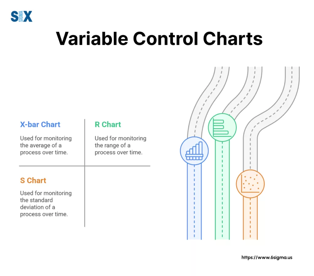
X̄-R Charts: The most commonly used variable control chart, X̄-R (pronounced “X-bar R”) charts consist of two components working together.
The X̄ chart plots the average of each subgroup to monitor the process center, while the R chart tracks the range within each subgroup to monitor process variation.
These Shewhart charts work best with subgroup sizes between 2-10 samples and are relatively easy to calculate and interpret. Manufacturing engineers often use X̄-R charts to monitor critical dimensions in production processes where taking multiple measurements is feasible.
X̄-S Charts: Similar to X̄-R charts, X̄-S charts also use two components. The X̄ portion remains identical, tracking subgroup averages. However, the S chart uses standard deviation rather than range to measure within-subgroup variation.
This makes X̄-S charts more statistically sensitive for larger subgroups (typically n > 10) where range becomes a less reliable estimate of variation. These charts are preferred in high-precision industries like electronics manufacturing where detecting subtle process shifts is critical.
Median Charts: These simplified variable control charts use the median (middle value) rather than the mean of each subgroup. While slightly less sensitive than X̄ charts, median charts are more resistant to outliers and easier to calculate by hand.
Quality technicians in fast-paced environments sometimes prefer median charts for their simplicity and robustness when extreme values occasionally occur.
Individual Data Charts
Not all processes allow for logical subgrouping. When measurements must be taken one at a time or when each measurement represents a complete production unit, individual data charts are the appropriate choice.
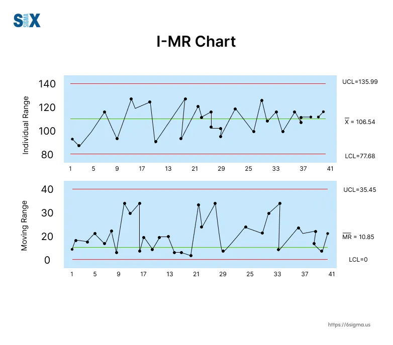
I-MR Charts: Individual-Moving Range (I-MR) charts track single measurements over time. The I chart plots each individual value, while the MR chart monitors the moving range (typically the absolute difference between consecutive points).
These Shewhart control charts are widely used for chemical processes, where testing might destroy the sample, or for low-volume production where waiting for multiple samples is impractical.
Moving Average Charts: These charts plot the average of a fixed number of consecutive points rather than individual values. This smoothing effect makes Moving Average charts better at detecting small, persistent shifts in the process mean.
They’re particularly useful in financial analysis and service processes where individual measurements show high natural variability.
EWMA Charts: Exponentially Weighted Moving Average charts give more weight to recent data while still considering older points. This makes EWMA charts extremely sensitive to small shifts in the process mean while remaining resistant to false alarms from isolated outliers.
Process engineers working with critical parameters often prefer EWMA charts when early detection of small shifts is essential.
With Six Sigma Green Belt Certification master these chart types and their application in real-world process improvement projects.
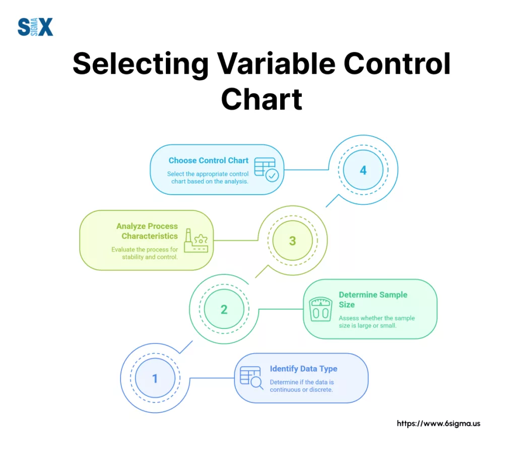
Selecting the Right Variable Control Chart
Choosing the appropriate variable control chart for your process is crucial for effective monitoring and improvement.
The wrong chart might miss important signals or generate false alarms, wasting valuable resources. Lean Fundamentals for process improvement and Six Sigma Green Belt Certification to build a solid foundation before implementing these statistical tools in your organization.
The selection process requires careful consideration of several key factors related to your data and process characteristics.
Decision Factors
Data Type: The nature of your measurement data significantly influences chart selection. Continuous measurements like weight, temperature, or dimensions typically work with any variable control chart.
However, the distribution of your data matters. Normally distributed data works well with standard Shewhart charts, while skewed data might require transformations or alternative charts like EWMA.
Sample Size: The number of measurements you can reasonably collect at each time point is another critical factor.
When you can collect multiple samples at once (subgroups), X̄-R or X̄-S charts become viable options. For subgroups of 2-9 items, X̄-R charts typically work best. With 10 or more items per subgroup, X̄-S charts provide better statistical sensitivity.
When only individual measurements are available, I-MR charts become necessary. Some processes naturally produce individual values rather than groups – like daily production totals or batch characteristics where each batch represents a single data point.
Process Characteristics: The behavior of your process should guide your chart selection. Processes with frequent, small shifts might benefit from EWMA or CUSUM charts, which are more sensitive to gradual changes.
Processes with high natural variability might need Moving Average charts to filter out noise. The cycle time of your process also matters – high-speed processes producing thousands of units hourly might require different monitoring approaches than processes producing a few units daily.
Consider whether your process has natural cycles or patterns that need to be accounted for in your control strategy.
Common Applications
Manufacturing Examples: In precision machining, X̄-R charts commonly monitor critical dimensions like shaft diameters or hole positions. The subgroups might consist of 5 consecutive parts measured every hour.
Chemical processing plants often use I-MR charts for batch properties like viscosity or pH, where each batch provides a single measurement.
Service Industry Applications: Call centers track average call handling times using I-MR charts, with each day’s average representing a single data point. Banking operations monitor transaction processing times with X̄-R charts, where samples of 5 transactions might be timed hourly.
Logistics companies use variable control charts to track delivery times, with EWMA charts helping detect gradual slowdowns in the delivery network.
Healthcare Uses: Laboratories monitor equipment calibration using Shewhart charts, ensuring testing devices remain accurate. Patient wait times are tracked using I-MR charts in many hospitals, with daily averages plotted to identify problematic trends.
Control Chart Type Selector
Answer the questions below to determine the most appropriate control chart for your process measurement.
Learn The Core Tools to Map, Measure, and Analyze Your Processes.
Get hands-on with SPC, MSA, and Capability studies quickly.
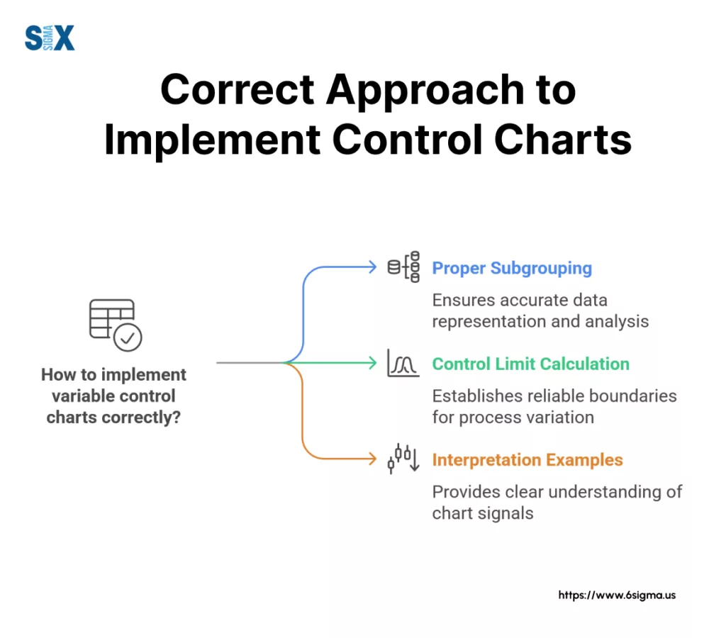
Interpreting Variable Control Charts
Creating a variable control chart is just the first step. The real value comes from correctly interpreting what the chart reveals about your process.
Effective interpretation requires understanding both statistical rules and pattern recognition skills. Six Sigma Black Belt Certification to develop deeper expertise in statistical analysis and process improvement methodologies that build on these fundamental chart interpretation skills.
A properly interpreted Shewhart control chart becomes a powerful diagnostic tool, revealing insights that might otherwise remain hidden in the raw data.
Control Rules
WECO Rules: The Western Electric Company (WECO) rules, developed in the 1950s, provide a structured approach to identifying special cause variation on Shewhart control charts.
These rules examine point patterns that have a low probability of occurring naturally in a stable process. The four primary WECO rules flag a process as potentially out of control when:
- Any single point falls beyond 3 standard deviations from the mean (beyond the control limits)
- Two out of three consecutive points fall beyond 2 standard deviations on the same side of the mean
- Four out of five consecutive points fall beyond 1 standard deviation on the same side of the mean
- Eight consecutive points fall on the same side of the mean
These rules balance sensitivity to real process changes against the risk of false alarms. The first rule detects major shifts, while the subsequent rules identify more subtle patterns that suggest process changes.
Nelson Rules: Donald Nelson expanded the WECO rules in the 1980s to create a more complete set of tests.
The Nelson rules include the original WECO tests plus four additional patterns:
- Six consecutive points steadily increasing or decreasing
- Fifteen consecutive points within 1 standard deviation of the mean (indicating stratification)
- Fourteen consecutive points alternating up and down (suggesting over-control)
- Eight consecutive points on both sides of the mean with none within 1 standard deviation (indicating mixture)
These additional tests help identify more complex process behaviors that might not trigger the basic WECO rules but still indicate non-random variation requiring investigation.
Zone Tests: Zone tests divide the Shewhart control chart into horizontal zones, typically:
- Zone A: 2-3 standard deviations from the mean
- Zone B: 1-2 standard deviations from the mean
- Zone C: 0-1 standard deviation from the mean
By tracking how points move between zones, quality professionals can apply tests like “two out of three points in Zone A or beyond” or “four out of five points in Zone B or beyond” to detect subtle process shifts.
Zone tests provide a visual framework that makes the statistical rules easier to apply and understand.
Pattern Analysis
Trends: A trend shows a consistent direction of movement over time. On variable control charts, six or more points continuously increasing or decreasing indicate a trend that likely requires investigation.
Trends often signal gradual process changes like tool wear, material aging, or environmental factors. For example, a rising trend in the diameter measurements of machined parts might indicate progressive tool wear affecting the cutting process.
Cycles: Cyclical patterns show regular up-and-down movements that repeat over time. These patterns might align with known factors like shift changes, maintenance schedules, or environmental cycles.
A manufacturing process might show temperature-related cycles corresponding to day/night patterns or HVAC cycling. Identifying the frequency and timing of cycles helps pinpoint their causes.
Shifts: A shift appears as an abrupt change in the process level, with points suddenly clustering around a different average. Eight consecutive points on one side of the centerline often indicate a shift.
Shifts typically result from sudden changes like new material batches, equipment adjustments, or procedural changes. Unlike trends, shifts maintain their new level until another change occurs.
Special Cause Variation: This term encompasses any non-random variation indicating something unusual affecting the process. Beyond the specific patterns above, special causes might appear as isolated outliers, unusual clustering, or erratic behavior.
The key distinction is that special cause variation results from specific, identifiable factors rather than the natural randomness inherent in the process.
Lead Projects That Drive Real Change Using Powerful Analytical Tools.
Move beyond identification to lead impactful process improvement projects with Six Sigma Green Belt Certification
Implementation and Best Practices
Successful implementation of variable control charts requires careful planning and execution.
Even the most statistically sound chart will fail to deliver value if the underlying data collection process is flawed or if the chart is misinterpreted.
Setup Guidelines
Data Collection: The foundation of any effective variable control chart is reliable data. Start by clearly defining what you’re measuring and ensure your measurement system is capable of producing consistent results.
Conduct a Measurement System Analysis (MSA) to verify that your gauges and measurement procedures introduce minimal variation.
Subgrouping Strategies: For subgrouped variable control charts like X̄-R or X̄-S charts, the subgrouping approach significantly impacts chart effectiveness.
Logical subgroups should represent conditions where only random variation is expected within the subgroup, while special causes might appear between subgroups.
This typically means collecting consecutive pieces within a short timeframe rather than random samples throughout the day.
Control Limit Calculation: Calculate control limits based on at least 20-25 subgroups (or individual points for I-MR charts) collected when the process is running normally.
Avoid including data from known special events or process adjustments during this initial phase. Use standard formulas for your specific chart type or reliable statistical software to calculate the limits.
Remember that control limits are not specification limits—they represent what the process actually does, not what it should do.
Common Pitfalls
Misinterpretation Risks: One frequent error is confusing control limits with specification limits. Control limits show what the process is capable of doing naturally, while specification limits represent customer requirements.
Implementation Challenges: Many organizations struggle with sustaining control chart usage over time.
Initial enthusiasm often wanes when charts become just another task without clear connection to business outcomes.
To avoid this, link chart usage to tangible benefits like reduced scrap, fewer customer complaints, or improved throughput.
Software and Tools
While variable control charts can be created manually, specialized software streamlines the process and adds powerful analysis capabilities.
The right software can transform raw data into actionable insights with minimal effort, allowing quality professionals to focus on improvement rather than calculation.
Modern SPC software ranges from standalone applications to modules integrated within larger quality management systems.
Popular options include Minitab, which offers robust statistical capabilities and is widely used in Six Sigma training; JMP, known for its interactive visualization features; and QI Macros, which adds SPC functionality to Excel.
When selecting software for variable control charts, consider these key features: ease of data import from your measurement devices, automation capabilities for routine charting tasks, and flexibility in chart customization.
Look for tools that support multiple chart types and offer built-in tests for special cause variation.
Explore Lean Six Sigma Certifications and techniques that complement variable control charts and create a complete process improvement toolkit.
Moving Ahead with Variable Control Charts
Variable control charts represent one of the most powerful tools available for process monitoring and improvement.
These Shewhart charts transform raw measurement data into visual signals that distinguish between normal process behavior and unusual patterns requiring attention.
Start with a single critical process variable, establish appropriate control charts, and build experience interpreting the results. As your confidence grows, expand to additional measurements and more sophisticated chart types.
Remember that control charts are not just statistical tools but communication devices that help teams develop a shared understanding of process behavior.
Your next steps might include selecting appropriate software, training your team on chart interpretation, or conducting a measurement system analysis to ensure data quality.
Whatever path you choose, the investment in understanding and applying variable control charts will pay dividends through more stable processes, reduced waste, and improved quality.
SixSigma.us offers both Live Virtual classes as well as Online Self-Paced training. Most option includes access to the same great Master Black Belt instructors that teach our World Class in-person sessions. Sign-up today!
Virtual Classroom Training Programs Self-Paced Online Training Programs