Run Chart vs Control Chart: Mastering Quality Management Tools
In quality management, choosing the right data visualization tool can make or break your process improvement efforts.
Whether you’re a quality control professional, a project manager, or a Six Sigma practitioner, understanding the nuances of a run chart vs control chart is crucial for making informed decisions about your process improvement initiatives.
Key Highlights
- The definitions and purposes of a run chart vs control chart
- When and how to use each type of chart effectively
- Key differences in their statistical complexity and interpretation
- Step-by-step methods for creating and implementing these charts in your processes
- Advanced applications and future trends in quality management tools
Introduction to Process Monitoring Tools
In quality management, understanding and improving processes is crucial.
Two powerful tools that help achieve this are run charts and control charts. Let’s dive into these statistical process control methods and explore their importance in data visualization.
Overview of Statistical Process Control
Statistical Process Control (SPC) is a method of quality control that uses statistical techniques to monitor and control a process.
It helps organizations maintain consistency in their operations by identifying and reducing variability.
Run charts and control charts are fundamental tools in SPC, allowing managers to visualize process performance over time.
Importance of Data Visualization in Quality Management
Data visualization plays a critical role in quality management by transforming raw data into easily interpretable visual representations.
These visual tools enable quick identification of trends, patterns, and anomalies in processes.
By using run charts and control charts, quality managers can make informed decisions and implement timely improvements.
Understanding Run Charts
Run charts are simple yet powerful tools for visualizing process data over time.
They provide valuable insights into process behavior and help identify potential areas for improvement.
Definition and Purpose of Run Charts
A run chart is a line graph that displays observed data in a time sequence.
Its primary purpose is to show how a process changes over time, helping to identify trends, shifts, or cycles in the data.
Run charts are particularly useful for monitoring process improvement efforts and detecting changes in process performance.
Components of a Run Chart
Run charts consist of two main components:
- Time series analysis: The horizontal axis represents time, while the vertical axis shows the measured variable.
- Median line: A horizontal line representing the median value of the data set, which helps identify shifts in the process.
Benefits and Limitations of Run Charts
Run charts offer several benefits, including simplicity, ease of construction, and the ability to quickly visualize trends.
However, they have limitations, such as the inability to distinguish between common cause and special cause variation, which control charts can do.
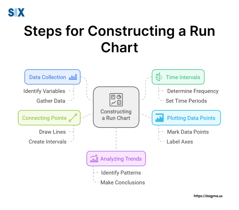
How to Construct a Run Chart
To construct a run chart:
- Collect data points over time
- Plot the data on a graph with time on the x-axis and the measured variable on the y-axis
- Calculate and draw the median line
- Connect the data points with a line
Exploring Control Charts
Control charts are more sophisticated tools that build upon the concept of run charts.
They provide additional statistical information to help determine if a process is in control.
Definition and Purpose of Control Charts
A control chart is a statistical tool used to study how a process changes over time.
It helps distinguish between common cause variation (inherent to the process) and special cause variation (indicating an issue that needs attention).
The primary purpose of control charts is to monitor, control, and improve process performance through statistical analysis.
Elements of a Control Chart
Control charts include several key elements:
- Upper and lower control limits: Calculated based on the process’s natural variation
- Centerline (mean): Represents the average value of the data set
- Data points: Individual measurements plotted over time
Types of Control Charts
There are various types of control charts, including:
- X-bar and R charts: Used for continuous data with subgroups
- p charts: Used for attribute data (pass/fail)
- c charts: Used for count data (number of defects)
How to Construct a Control Chart
To construct a control chart:
- Collect data and organize it into subgroups if applicable
- Calculate the mean and control limits
- Plot the data points, centerline, and control limits
- Analyze the chart for any out-of-control points or patterns
Learn end-to-end explanation of control charts and their construction with Lean Six Sigma Green Belt
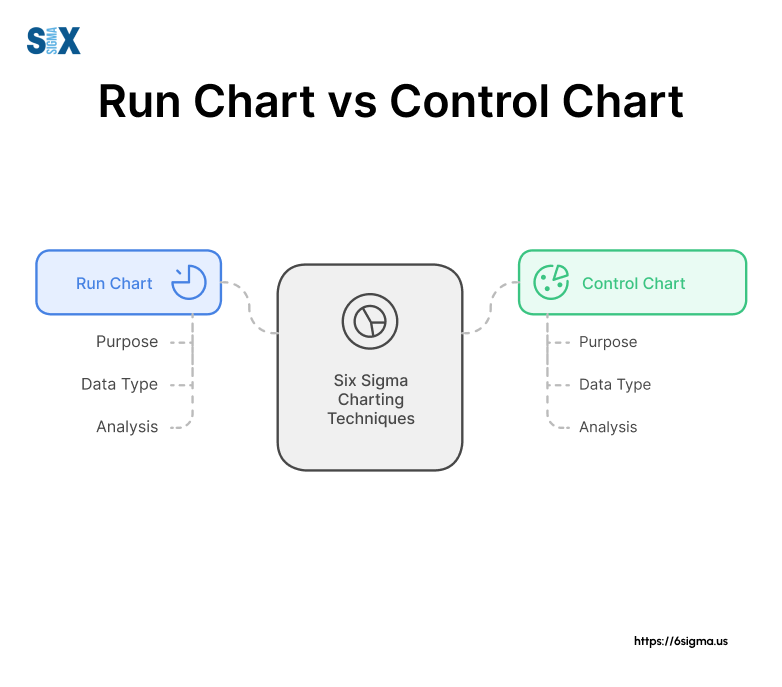
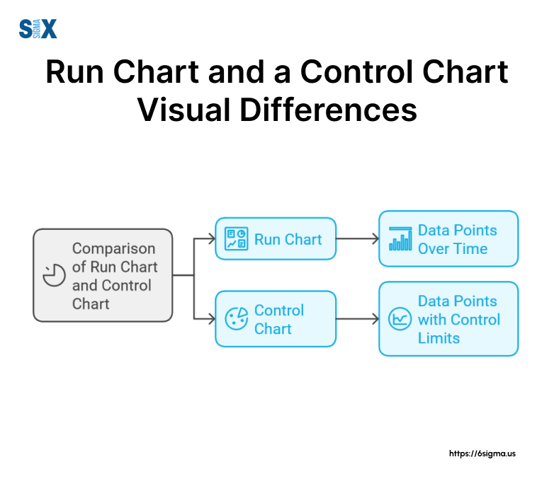
Run Chart vs Control Chart: Key Differences
While both run charts and control charts are valuable tools for process monitoring, they have distinct differences in their capabilities and applications.
Statistical Analysis Capabilities
The primary difference between a run chart vs control chart lies in their statistical analysis capabilities.
Control charts can distinguish between common cause variation and special cause variation, while run charts cannot.
This ability makes control charts more powerful for identifying process instability.
Process Stability Assessment
Control charts use control limits to assess process stability, while run charts rely solely on the median line.
Control limits are statistically calculated boundaries that help determine if a process is in control.
Specification limits, which are different from control limits, represent the desired performance range set by customer requirements or internal standards.
Trend Identification and Pattern Recognition
Both run charts and control charts can identify trends, but control charts offer more sophisticated pattern recognition.
For example, the Rule of Seven in control charts states that seven consecutive points on one side of the centerline indicate a significant shift in the process.
Data Interpretation and Decision-Making
Control charts provide more structured guidance for data interpretation and decision-making.
They offer clear signals for when to investigate special causes, whereas run charts require more subjective interpretation of trends and patterns.
Know which chart are exactly for which purpose and work! learn the differences between run charts and control charts with Lean Six Sigma Black Belt
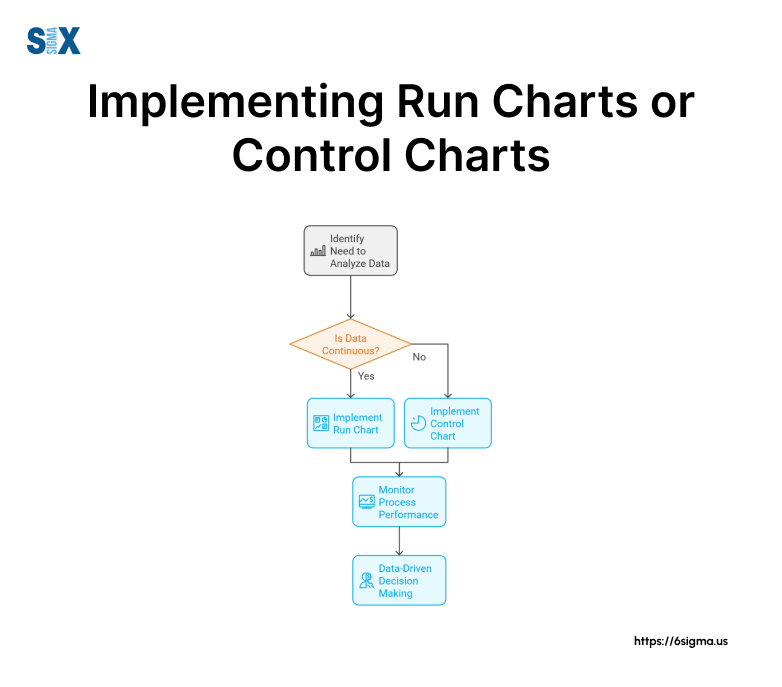
Choosing Between Run Charts and Control Charts
Selecting the right tool for your process monitoring needs depends on various factors and the specific goals of your quality assurance program.
Factors to Consider
When choosing between run charts and control charts, consider:
- Process behavior and complexity: More complex processes may benefit from control charts
- Available data and sample size: Control charts typically require more data points
- Quality assurance goals: Determine if you need to distinguish between common and special cause variation
Scenarios for Using Run Charts
Run charts are ideal for:
- Initial process analysis
- Monitoring simple processes
- Tracking improvement initiatives
- Situations with limited data points
Scenarios for Using Control Charts
Control charts are best suited for:
- Ongoing process monitoring
- Complex manufacturing processes
- Situations requiring distinction between common and special cause variation
- Processes with sufficient data points for statistical analysis
Combining Both Tools for Comprehensive Analysis
In many cases, using both run charts and control charts can provide a more comprehensive understanding of your processes.
Start with run charts for initial analysis, then progress to control charts for more detailed statistical monitoring.
Applying Run Charts and Control Charts in Practice
Let’s explore how these tools are applied in various industries and scenarios to drive process improvement and maintain quality standards.
Manufacturing Process Control Examples
In manufacturing, run charts and control charts are widely used to monitor production line efficiency, product quality, and equipment performance.
For instance, a pharmaceutical company might use control charts to monitor the weight consistency of pills during production.
Service Industry Applications
Service industries can benefit from these tools as well.
A call center might use run charts to track average call handling times, while a hospital could employ control charts to monitor patient wait times in the emergency department.
Continuous Improvement Strategies
Both run charts and control charts play crucial roles in continuous improvement methodologies like Six Sigma and Lean.
They help identify areas for improvement, measure the impact of process changes, and sustain gains over time.
Performance Monitoring Best Practices
To get the most out of run charts and control charts:
- Regularly update and review charts
- Involve process owners in data analysis
- Use appropriate chart types for your data
- Act on the insights gained from the charts
Conclusion
Understanding the differences between a run chart vs control chart is crucial for effective process monitoring and improvement.
Recap of Run Chart vs Control Chart Differences
While run charts offer simplicity and ease of use, control charts provide more statistical rigor and the ability to distinguish between different types of process variation.
Both tools have their place in quality management and can be used complementarity for comprehensive process analysis.
Importance of Choosing the Right Tool for Process Improvement
Selecting the appropriate chart type for your specific needs is essential for accurate process monitoring and effective decision-making.
Consider your process complexity, data availability, and quality assurance goals when making your choice.
Future Trends in Statistical Process Control and Quality Management
As technology advances, we can expect to see more integration of real-time data analytics and machine learning in statistical process control.
These advancements will likely enhance the capabilities of both run charts and control charts, making them even more powerful tools for driving continuous improvement and maintaining high-quality standards across industries.
SixSigma.us offers both Live Virtual classes as well as Online Self-Paced training. Most option includes access to the same great Master Black Belt instructors that teach our World Class in-person sessions. Sign-up today!
Virtual Classroom Training Programs Self-Paced Online Training Programs