Six Sigma Terminology – P chart. What is it and How it Works
Organizations bank on reliable quality and minimal defects fuelling success. An outstanding ally hitting that target involves the p-chart, also known as the proportion control chart.
This potent statistical technique tracks and analyzes non-compliant piece rates over time within methods.
It’s handy when data classifies each unit simply as “hits standard” or “misses standard” based on pre-set specs.
By monitoring the proportion not measuring up, p-charts pinpoint patterns, trends, and potential glitches, empowering corrective moves and constant upgrading.
Whether in manufacturing, healthcare, or service fields, p-charts lend insightful quality oversight, fewer defects, and delighted clients.
Their ability to filter non-routine process deviations makes p-charts indispensable for quality pros, engineers, and workflow directors alike.
Mastering p-charts unlocks enhanced consistency empowering businesses through deeper challenges ahead by rigorously refining performance.
Key Highlights
- The p-chart, aka proportion control chart, brings potent stats smarts to quality oversight and workflow surveillance.
- It helps track glitches down by monitoring the ratio of stuff with defects batch by batch across time.
- It fits well when info classifies each thing as merely “on point” or “off base” to baseline needs.
- P-charts aid in marking deviations from regular patterns, enabling addressing underlying issues and upgrading processes consequently.
- Its use spans industries from manufacturing and healthcare to services—fueling reliable quality outcomes essential to thriving.
What is P-Chart?
The p-chart, sometimes called the proportion nonconforming control chart, wields potent stats for quality oversight and workflow surveillance.
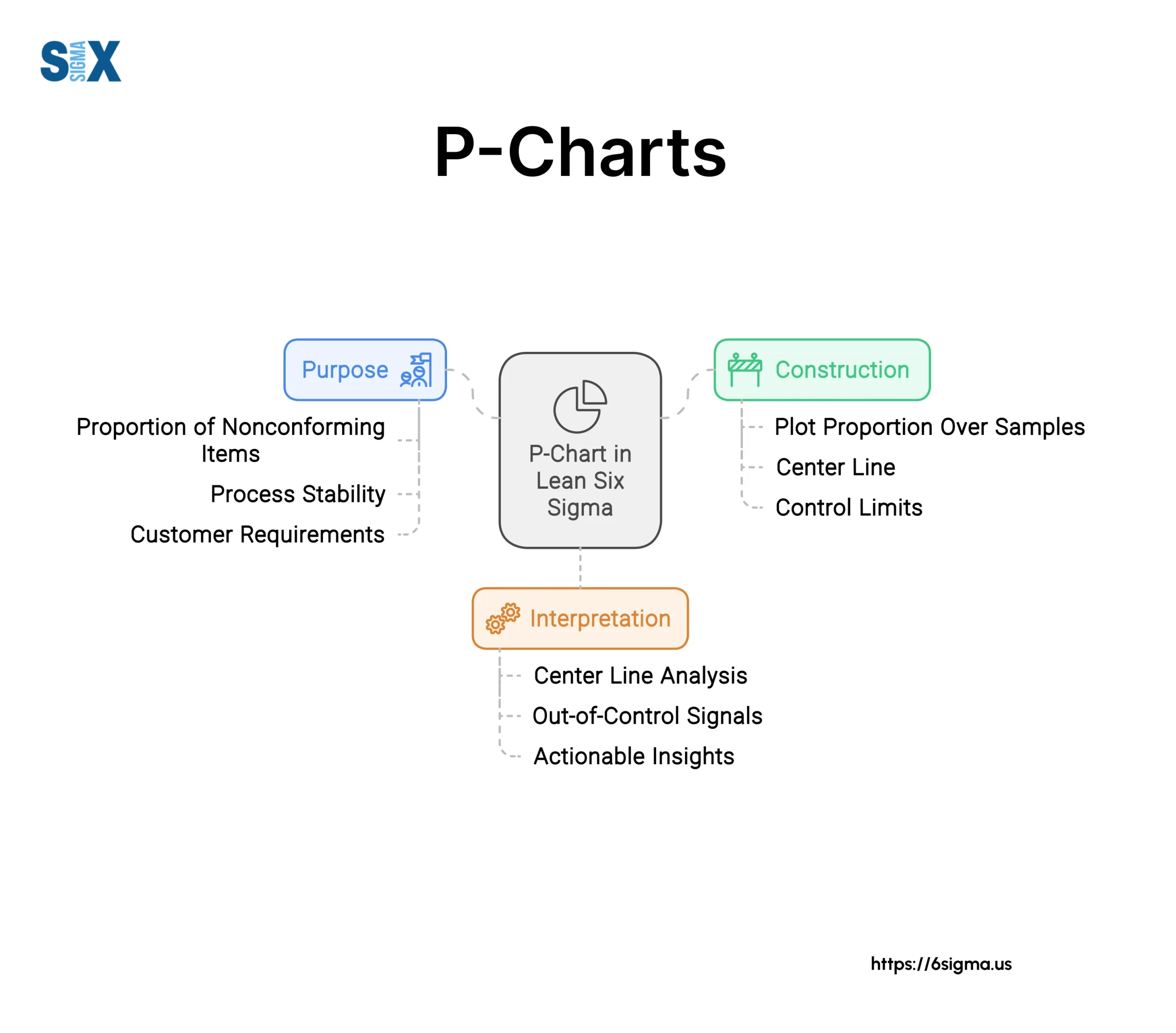
Specifically designed to monitor and analyze the ratio of defective units batch-to-batch, it fits like a glove when info is binary as simply on point or off base.
One of manufacturing’s most used control charts, p-charts smoke out process shifts potentially impacting final quality.
Watching defect rates evolve alerts companies to issues, enhancing product grade and slashing remedy costs through preemptive upgrades.
The p-chart assumes chance alone determines satisfactory units produced—an even probability maintained within.
It plots nonconforming ratios against time/samples alongside tolerance borders flagging regular variance.
Key aspects involve the mean line denoting quality goals, up/low control limits marking unacceptable variability, consistent subset sizes informing the chart, and metrics revealing underlying reasons when off-nominal.
P-charts offer a window revealing drifts/tendencies. Organizations promptly remedy deviations between
Subgroup size: The p-chart is typically constructed using data from rational subgroups, which are samples of fixed size taken from the process at regular intervals.
Processes: Identify what or who constrains advancement, and take fitting steps stabilizing operations and raising the standard continually
P Chart Construction
Constructing a p chart is a straightforward process, but it requires understanding the data and calculations involved. The key components needed to create a p chart are:
Defect Data
To construct a p chart, you must have data on the number of defects or nonconforming units found during the inspection of product samples or subgroups. This defect data forms the basis of the chart.
Sample Size
The p chart requires knowing the size of each sample or subgroup that was inspected for defects. This sample size allows calculating the fraction nonconforming for each subgroup plotted on the chart.
Subgroup Size
Samples are typically grouped into rational subgroups based on factors like inspection time, machine, operator, etc. The subgroup size should be constant across the chart.
Center Line and Control Limits
The centerline on a p chart represents the overall fraction of defective units, calculated as:
p-bar = Total nonconforming units / Total units inspected
The control limits are calculated based on the p-bar and the subgroup size. For p charts, the formulas are:
UCL = p-bar + 3 * sqrt((p-bar * (1 – p-bar)) / n)
LCL = p-bar – 3 * sqrt((p-bar * (1 – p-bar)) / n)
Where n is the subgroup sample size.
With the defect data organized into subgroups, the sample sizes, p-bar, and control limits calculated, the p chart can be constructed by plotting the fraction nonconforming for each subgroup on the chart’s scale.
Proper determination of rational subgroups and maintaining consistent subgroup sizes are critical for the p chart to function correctly. Care must also be taken in data collection to avoid errors.
P Chart Analysis and Interpretation
Once you have constructed a p chart, the next step is to analyze and interpret what it is telling you about your process. There are some key things to look for:
P Chart Control Limits
The control limits on a p chart are critical for detecting if the process is in statistical control or not. The control limits are calculated based on the overall proportion of defectives/nonconformities across all subgroups.
Any points falling outside the control limits indicate the process was unstable and out-of-control for that subgroup sample.
P Chart Patterns and Runs
Beyond just points exceeding the control limits, you also want to look for any abnormal patterns or runs that can indicate something unusual is occurring. This includes things like:
- 7 consecutive points above or below the center line
- 10 out of 11 consecutive points on the same side of the center line
- 14 or more consecutive points alternating up and down
These types of patterns, while still within the control limits, are statistically unlikely to occur from normal random variation.
P Chart Stability and Variation
A stable p chart will have points randomly dispersed above and below the center line within the control limits. Excessive variation, with points constantly bouncing between the upper and lower control limits, indicates an unstable process that should be improved.
P Chart Interpretation Rules
There are some general rules for interpreting what the p chart is indicating:
- A point above the UCL means there was a higher-than-expected rate of defective
- A point below the LCL means there was a lower-than-expected rate of defective
- A run above or below the centerline means the defective rate was higher or lower than average for that period
- An unstable or out-of-control process signals that the causes of variation need to be investigated and removed
By carefully analyzing the control limits, patterns, stability, and applying interpretation rules, you can use the p chart to monitor the performance of an attribute process over time.
Comparing P Charts with Other Charts
While p charts are useful for analyzing attribute data based on defect rates or nonconformities, other types of control charts can be used depending on the situation. It’s important to understand how p charts differ from other charts so you can select the right tool.
P Chart vs. Np Charts
The np chart is similar to the p chart in that it also monitors attribute data based on the number of defective items or non-conformities. However, NP charts are used when the sample size or subgroup size varies from sample to sample. P charts require a constant sample size.
P Chart vs. C Charts
The c chart is used to monitor defects per unit rather than the proportion of defective units. C charts analyze variable data such as the number of imperfections on a painted surface. P charts look at attribute data where the unit is either conforming or nonconforming.
P Chart vs. U Charts
U charts are used when the number of nonconformities per unit can be more than one. For example, tracking scratches or dents on a product. P charts only consider whether the unit is conforming or not (pass/fail).
P Chart vs. X-bar and R Charts
X-bar and R charts are used for variable data such as monitoring a process average and range. P charts monitor attribute data related to the proportion of defective items.
Using P Chart in Software
P charts are commonly used in various statistical software packages to analyze attribute data and monitor process performance.
Most quality control software includes the ability to generate and analyze P charts. Here are some examples of how P charts can be used in different software:
Minitab
Minitab is a popular statistical software that offers comprehensive tools for creating and analyzing control charts, including P charts.
With Minitab, you can easily construct P charts, calculate control limits, test for normality, and identify out-of-control points. The software also provides capabilities for stratification, capability analysis, and process capability indices for P charts.
Excel
While Excel does not have built-in functionality for P charts, you can use add-ins or write macros to create and analyze them.
For example, the QI Macros add-in for Excel allows you to generate P charts along with other control charts. Excel can be a cost-effective option for basic P chart applications, although it may have limited advanced analysis features compared to dedicated statistical packages.
Python
For those familiar with programming, Python libraries like SciPy and Statsmodels offer functions to create and work with P charts.
This can be useful for integrating P chart analysis into larger data analysis pipelines or building custom applications. However, coding P chart functions from scratch can be time-consuming compared to using pre-built software.
R
Like Python, the R programming language and its associated packages (like qcc) provide extensive control charting capabilities, including functions for constructing and evaluating P charts.
R can be a powerful choice for advanced statistical modeling and analysis involving P charts.
Commercial SPC Software
There are also various commercial statistical process control (SPC) software packages that include tools for P chart analysis, such as Minitab Quality Companion, EngineRoom, and Quality America SPC Software.
These specialized solutions often offer user-friendly interfaces, automation features, and integration with manufacturing systems.
Case Studies and Examples of p Chart
To better understand how P-charts are used in situations, let’s look at a few case studies and examples:
Manufacturing Example
A company that manufactures electronic components needs to monitor the defect rate of the circuit boards they produce. They randomly select 100 boards each hour and record the number of defective boards.
Using a P-Chart, they can plot the proportion of defective boards for each hourly sample. The center line represents the overall average defect rate. The control limits show the expected range of variation from random causes alone.
If a point falls outside the control limits, it indicates the process may be out of control due to an assignable cause that should be investigated and corrected. The P-Chart allows them to quickly detect excessive variation and take corrective action before too many defects are produced.
Service Industry Example
A call center tracks the number of calls with billing errors out of all calls received each day. They use a P-Chart to monitor the proportion of calls with billing errors over time.
The P-Chart allows them to identify any unusual days where the error rate was higher than expected based on the control limits calculated from past data. Patterns like runs above or below the center line can also signal potential issues.
If the P-Chart indicates the process is out of control, the center can investigate issues like training gaps, new employee onboarding problems, or software glitches that may be causing the increased errors.
Healthcare Case Study
A hospital analyzed historical data on the rate of hospital-acquired infections over two years. They constructed a P-Chart to establish baseline performance and control limits.
After implementing new safety protocols, the P-Chart allowed them to monitor the proportion of infections going forward. The chart signaled that the new protocols effectively reduced the infection rate to below the historical average.
However, the P-Chart also detected a period where the infection rate spiked back up, alerting them to a process issue that needed to be addressed with additional training or procedures.
Best Practices and Limitations of p Chart
While P-charts are powerful tools for analyzing attribute data, there are some best practices to follow and limitations to be aware of:
Best Practices
- Ensure the data meets the assumptions for a P-Chart (binomial distribution, constant area of opportunity, etc.)
- Use rational subgroup sizes that make sense for your process (e.g. one hour, one shift, one day)
- Examine patterns, runs, and hugging lines to identify assignable causes
- Establish control limits with 20-25 subgroups of data when bringing a new process online
- Periodically re-calculate control limits, especially after improvements are made
Limitations
- P-charts only analyze the proportion of defective, not the severity of the defects
- Small subgroup sizes can make P-charts less sensitive to shifts in the process
- As the proportion of defective gets very small or very large, P-Charts lose discrimination
- The normality assumption may be violated if the expected proportion is tiny (<0.01) or very large (>0.20)
- P-Charts do not directly provide a process capability metric like a Cp or Cpk
To maximize the value from P-Charts, follow best practices around subgrouping, identifying patterns, and establishing proper control limits. However, understand the limitations as well.
P-charts do not provide insight into defect severity or process capability. In situations with very high or very low defect rates, an NP-Chart may be preferred over a P-chart.
SixSigma.us offers both Live Virtual classes as well as Online Self-Paced training. Most option includes access to the same great Master Black Belt instructors that teach our World Class in-person sessions. Sign-up today!
Virtual Classroom Training Programs Self-Paced Online Training Programs