Lean Six Sigma Methodology. What is Np-chart?
Quality monitoring and workflow refinement are important for any business to consistently fulfill client demands.
Statistical process control approaches prove helpful statistical tools here. One effective gizmo specifically applicable to quality metrics involves the np chart.
Short for “nonconforming units”, np charts track defective quantities amid test samples/batches.
Employed where characteristics measure binary (compliant/noncompliant), np charts assist non-spec pieces reconnaissance.
Graphing defective counts versus time/samples, np charts distinguish processes within expected ranges versus those deviating unexpectedly.
Key Highlights
- The np chart exists as a control chart monitoring and studying attribute data from workflows.
- It tracks non-compliant piece counts per test batch/subset. Fitting wherever the subgroup size stays steady.
- The np chart identifies normalcy’s limits, flagging abnormal conduct requiring remedy.
- Properly leveraging np charts elevates quality, lowers costs, and enhances proficiency.
- Essentials for effective np charting cover sample sizes, tolerance borders, and deciphering patterns pinpointing impending instability.
- Ubiquitous applications range industries from manufacturing, and healthcare to services—wherever processes measure binary conformance.
What is an np-Chart?
The np chart proves a control chart applicable to statistical process control monitoring non-compliant piece enumeration.
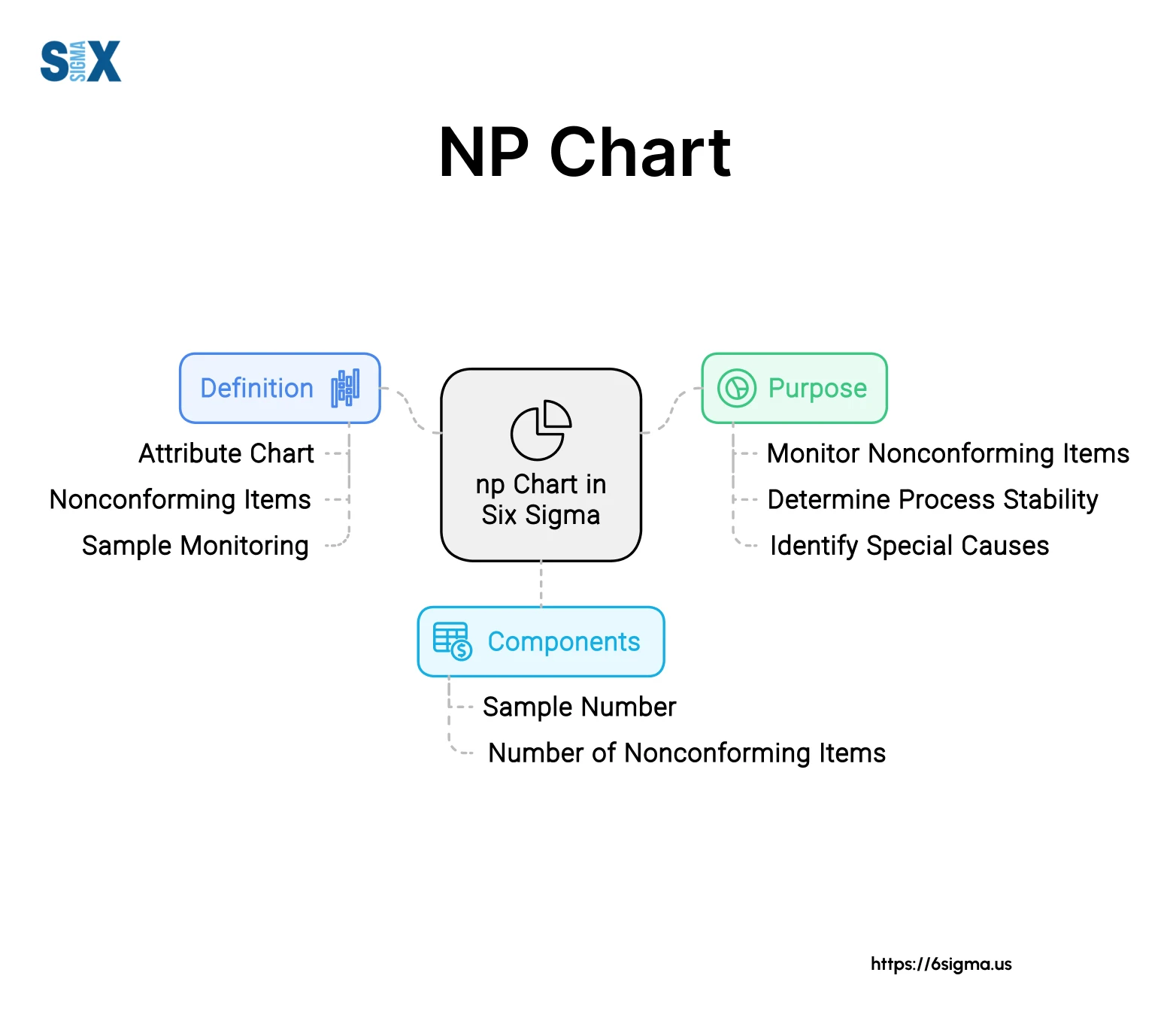
It studies attributes – binary classifications conforming/not thanks to inspecting units versus standards.
Positioning defect rates over continuity discloses workflow divergences necessitating investigation/fixes.
Applicable anywhere attributes arise—manufacturing tracking flaws, healthcare glitches, food safety concerns, and quality auditing.
Monitoring np against predictable ranges flags non-routine patterns precisely flagging instability’s early onset, and preventing mass issues.
Part of attribute charts including p, c, and u charts, np charts specifically address steady subgroup sizes, and applicable repetitive workflows with predetermined batch data.
Fundamental Concepts of an np-Chart
The np chart is a type of control chart used to monitor attribute data from a binomial distribution. Attribute data deals with defective or non-defective items, rather than measured values. The np chart plots the number of defective units or nonconforming units in each sample or subgroup.
Some key fundamental concepts around np charts include:
Sample Size and Subgroup Size
The np chart requires rational subgroups of consistent sample sizes. The sample or subgroup size (n) should be constant across the chart. Typical subgroup sizes range from 20-200 units.
Nonconforming Units
Each subgroup contains a certain number of nonconforming or defective units. This is represented by the variable “np” where n is the subgroup size and p is the fraction nonconforming.
Binomial Distribution
The np chart is based on the binomial distribution, which models the probability of nonconforming units in a sample of fixed size when there are just two possible outcomes (defective or non-defective).
Control Limits
The np chart calculates the central line (CL) as well as upper (UCL) and lower control limits (LCL) based on the expected nonconforming rate and sample size. Data points beyond the control limits signal an out-of-control condition.
Constructing an np Chart
To construct an np chart, you need to follow several steps to ensure it is set up correctly. First, you’ll need to determine the appropriate subgroup size and rational subgrouping for your data.
The subgroup size (n) should represent a sample of units that were produced under essentially the same conditions. Rational subgroups could be based on time periods, operators, machines, etc.
Next, you’ll calculate the number of nonconforming units (np) in each subgroup. This is the key data point that will be plotted on the np chart. The formula for np is simply the number of defective or nonconforming units in the subgroup.
With the np values calculated, you can determine the central line and control limits for the chart. The central line is the average np value across all subgroups.
This represents the expected number of defects. The control limits are calculated based on the subgroup size and the expected np using the binomial distribution probability formulas.
The upper control limit (UCL) is typically set at np + 3√(np(1-p)), where p is the fraction nonconforming. The lower control limit (LCL) is 0 or np – 3√(np(1-p)), whichever is greater. Control limits are used to identify unusual variation that may require investigation.
Once the control limits are calculated, you can plot the np values from each subgroup on the chart between the LCL and UCL lines. Any points outside the control limits, or any unusual patterns or runs, may indicate the process is out of control and corrective action is needed.
np Chart vs p Chart
While both the np chart and p chart are used for monitoring attribute data from a production process, there are some key differences between them. The main distinction lies in how the data is collected and analyzed.
The np chart is used when you are counting the total number of nonconforming units or defects in each sample or subgroup. The subgroup size can vary, but must be clearly defined. The np chart plots the number of nonconformities against the subgroup or sample number.
In contrast, the p chart monitors the fraction nonconforming or proportion defective in each constant-sized sample.
The p chart plots the nonconforming proportion or fraction against the subgroup number. Unlike the np chart where the subgroup size can vary, the p chart requires a constant sample size across all subgroups.
Another key difference is the statistical distribution that underlies each chart. The np chart relies on the binomial distribution, while the p chart utilizes the binomial approximation to the normal distribution when calculating control limits.
The choice between using an np or p chart depends on the data collection method and the goals of the analysis. If you are interested in monitoring the actual count of defects or nonconformities, and subgroup sizes can vary, the np chart is more appropriate.
However, if you want to analyze the proportion nonconforming with constant sample sizes, the p chart would be the better control chart to use.
np-Chart Control Chart Best Practices
Implementing np charts effectively requires following several best practices related to data collection, chart setup, interpretation, and process monitoring.
Data Collection & Sampling
- Collect data in rational subgroups representing samples from a single source during a short time period
- Ensure subgroup sizes are consistent – using varying sample sizes violates the np chart assumptions
- For processes with 100% inspection, subgroup size can equal the total output for that time period
- For sampling plans, use random sampling and appropriate subgroup sizes based on sampling inspection level
np-Chart Setup
- Calculate appropriate control limits based on specified process parameters or from initial baseline data
- Control limits should be recalculated whenever the process undergoes a major change
- Use control rules like western electric rules to enhance sensitivity to process shifts
- Ensure control chart scaling and layout follows best practices for clear visualization
Interpretation & Process Monitoring with np-Chart
- Analyze patterns and trends in the data, not just individual points outside control limits
- Implement a systematic reaction plan for investigating out-of-control signals
- Continuously update control limits as the process demonstrates sustained improvement
- Integrate np charts with other process behavior and capability analysis tools
Organizational Support
- Provide comprehensive training on control chart concepts and interpretation
- Implement control charting software to enable real-time monitoring and data analysis
- Ensure management commitment to using control charts as a process monitoring technique
- Tie control chart monitoring to initiatives like lean manufacturing and Six Sigma
Case Studies and Examples of Usage of np-Chart
To better illustrate how np charts are used in real-world scenarios, let’s look at a few case studies and examples:
Manufacturing Example
A factory that produces electronic components wants to monitor the number of defective units in their production process. They randomly select samples of 50 units from each hour’s production and record the number of defective units found.
With an np chart, they can plot the number of defective units against the upper and lower control limits calculated from the expected defect rate (e.g. 1 defect per 100 units).
Any points outside the control limits would signal an out-of-control condition requiring investigation and corrective action.
Service Industry Example
A call center has a team of 50 agents handling customer inquiries. Management wants to monitor the number of calls resulting in customer dissatisfaction (e.g. unresolved issue, rude agent). Each day, 10 calls per agent are randomly selected and evaluated.
Using an np chart with the number of dissatisfied customers plotted over time can reveal if there are any systemic issues causing unusually high rates of customer dissatisfaction. Special cause variations can be investigated and addressed.
Healthcare Application
In a hospital’s sterile processing department, instrument trays are assembled and sterilized for use in surgeries. To ensure quality, a sample of 5 trays is inspected each hour for any non-conformances (e.g. missing items, improperly wrapped).
An np chart allows the sterile processing supervisors to monitor the number of non-conforming trays over time. If the number exceeds the control limits, it may indicate issues with staff training, procedures, or equipment that need to be addressed.
Resources and Tools for np-Chart
Having the right resources and tools can make constructing, analyzing, and interpreting np charts much easier. Here are some useful resources and tools for working with np charts:
Books
- Introduction to Statistical Quality Control by Douglas C. Montgomery
- The Certified Quality Engineer Handbook by Connie Borror
- Statistical Quality Control by Eugene L. Grant and Richard S. Leavenworth
Software
- QI Macros SPC Software for Excel
- Minitab Quality Companion
- EngineRoom SPC Software
Many quality/process improvement programs like Six Sigma and Lean provide training on using and interpreting control charts like the np chart. Taking advantage of these training resources can help build capabilities.
Additionally, there are control chart consultants who can provide personalized guidance and coaching for specific applications. Having an experienced consultant can accelerate learning and ensure proper use.
No matter what resources are used, it’s important to have a solid understanding of the statistical concepts behind np charts. With the right training and tools, np charts can be a powerful technique for monitoring and improving processes.
SixSigma.us offers both Live Virtual classes as well as Online Self-Paced training. Most option includes access to the same great Master Black Belt instructors that teach our World Class in-person sessions. Sign-up today!
Virtual Classroom Training Programs Self-Paced Online Training Programs