Normal Probability Plot Explained. A Detailed Guide
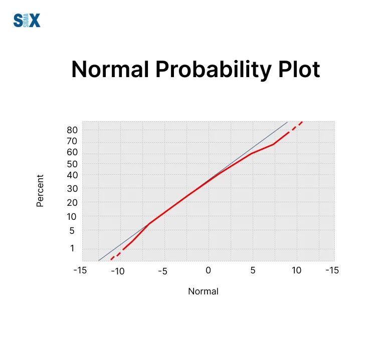
Normal Probability Plot visually show just how closely information points align with the standard normal distribution.
These plots take the percentiles from observed values compared to normal percentiles, lining them up graphically.
If we notice an almost straight line, the data likely adheres to a normal curve. Significant line divergence, however, may signify otherwise.
Normal Probability Plot offers clear advantages over traditional normality testing. Beyond just highlighting normal fits, they straightforwardly expose skewed, outlier-plagued, or heavier-tailed divergences from normalcy.
This makes the visuals extremely helpful for preliminary data checks and validity confirmation. By presenting normal matches and departures simply, Normal Probability Plot upgrade initial understanding and flag where deeper analyses become invaluable.
Their clarity champions informed next steps, whether optimizing operations through methodologies like Six Sigma certification or advancing analyses through initial normal distribution comprehension.”
Key Highlights
- Normal Probability Plots provide a visual way to check if the information fits a normal bell curve.
- They map percentiles from observed values against theoretical normal percentiles on a graph.
- Nearly straight linings indicate adherence to the normal shape.
- These plots helpfully assess normal distribution assumptions in stats examinations just by viewing.
- Outliers, skewness, and other non-normal qualities become clear.
- Crucial prowess in analytics and quality oversight involves generating and understanding what normal probability pictures communicate.
- A deft hand with these visual normality checkers remains invaluable for spotting abnormalities prompting special investigation, optimizing processes through deeper exploration armed with initial plot comprehension, as well as validating findings before reporting.
What is a Normal Probability Plot?
Normal Probability Plot visually flag meaningful divergences from normality within information sets.
They let teams effortlessly assess if data adheres to the normal bell curve using stat tests.
The normal distribution, understood too as Gaussian or bell shape, provides symmetry around averages – a pattern essential natural phenomena commonly follow and therefore important in numbers examinations.

Charting values on these plots helps since any odd non-straight patterns reveal characteristic departures. This diagnosis aids in solving issues and finding remedies.
Key attributes:
- Values are arranged along the X-axis
- Cumulative changes or percent totals lift the Y-axis
- Perfectly normal plots a direct line
- Curved or S bends indicate skewing
- End clustering hints outliers or weightier distributions
Essentially, Normal Probability Plot reorders figures ascending and compares them against anticipated normal distribution points.
Interpreting Normal Probability Plot
A normal probability plot is a graphical technique to assess whether a dataset follows a normal distribution.
It plots the quantiles of the dataset against the quantiles of a standard normal distribution. If the data points follow an approximately straight line, it suggests the data is normally distributed.
Identifying Normality
On a normal probability plot, if the data points cluster tightly around the straight reference line, it indicates the dataset is likely normally distributed.
The closer the points hug the line, the stronger the evidence for normality.
Detecting Non-Normality with Normal Probability Plot
Deviations from the straight reference line indicate departures from normality. If the data points curve or trail off the line systematically, it signals the data is non-normal. Different patterns suggest different types of non-normality:
S-curve: Data is skewed, with one tail heavier than the other
Curved line: Data has heavier or lighter tails than a normal distribution (kurtosis)
Uneven scatter: Data has outliers, multi-modality, or other anomalies
Quantifying Deviations
While interpreting visually, it also helps to quantify the deviations statistically. Common metrics are the correlation coefficient (closer to 1 indicates normality) and test statistics like Anderson-Darling.
Assessing Fit in the Tails
Normal probability plots are especially useful for assessing the fit in the extreme tails of a distribution. This is critical for applications like quality control, risk modeling, etc.
Creating Normal Probability Plot
There are several methods to create normal probability plots depending on the software or programming language you are using. Here are some common approaches:
In Excel
- Enter your data into a column
- Go to the Data Analysis toolpak (if not installed, install it first from File > Options > Add-Ins)
- Select “Normal Probability Plot” from the tools
- Enter the range for your data into the input box and check any additional options you want
- Click OK to generate the normal probability plot
In R
- Enter your data into a vector x
- Use the qqnorm() function: qqnorm(x)
- This will generate a normal quantile-quantile plot
- You can add a reference line: qqline(x)
In Minitab
- Enter your data into a column
- Select Stat > Quality Tools > Normal Plot
- Select your data column in the pop-up window
- Click OK to generate the normal probability plot
In Python
- Import packages like matplotlib, scipy, statsmodels
- Enter data into a NumPy array
- Use probability plot functions like scipy.stats.probplot() or statsmodels.api.ProbPlot()
- Customize formatting and add reference lines as needed
In SPC Software
Many statistical process control (SPC) software packages like Minitab, MATLAB, and specialized tools have built-in functions to easily generate normal probability plots from your data.
Statistical Tests for Normality
While visually inspecting a normal probability plot can give you a good sense of whether your data follows a normal distribution, there are also statistical tests that can quantify the degree of non-normality.
These are especially useful when you have a large data set where deviations from normality may be difficult to detect by eye.
Anderson-Darling Test
The Anderson-Darling test is a statistical technique used to test if a data sample comes from a specific probability distribution, such as the normal distribution. It gives more weight to the tails of the distribution than the Kolmogorov-Smirnov test.
The test makes use of the cumulative distribution function of the specified distribution. The Anderson-Darling statistic measures how well the data conforms to the distribution, with a lower statistic indicating the data is more likely to have come from that distribution.
Shapiro-Wilk Test
The Shapiro-Wilk test is another commonly used test to assess normality. It is generally considered an excellent approximation of normality, especially for sample sizes up to 2000.
The test compares the quantiles of the data to a normal distribution. A p-value is calculated, with a small p-value indicating a departure from normality.
Skewness and Kurtosis
While not formal statistical tests, calculating the skewness and kurtosis of a data set can also shed light on normality. Skewness measures the asymmetry of the probability distribution, while kurtosis measures its “tailedness”.
For a perfectly normal distribution, the skewness should be 0 and the kurtosis should be 3. Significant deviations from these values indicate non-normality.
Dealing with Non-normal Data
While normal probability plots are incredibly useful for assessing normality, actual data often violates the assumption of normality.
For teams trained in root cause analysis training, non-normal patterns in plots signal the need to investigate underlying process inefficiencies.
When data is non-normal, it can have implications for the statistical tests being used and the validity of the results. There are a few different approaches for dealing with non-normal data distributions:
Data Transformations
One technique is to apply a data transformation to better approximate a normal distribution.
Common transformations include:
- Log transformation – takes the natural log of the data values
- Square root transformation – takes the square root of the data values
- Box-Cox transformation – uses maximum likelihood to find the optimal transformation parameter
These transformations can help reduce skewness and make the data more symmetric and normal-like.
However, transformations add complexity and can make interpreting the results more difficult.
Courses like Lean fundamentals teach how to streamline data workflows, ensuring transformations align with broader operational efficiency goals.
Nonparametric Tests
An alternative is to use nonparametric or distribution-free statistical methods that do not assume normality. Some examples include:
- Wilcoxon signed-rank test instead of a one-sample t-test
- Mann-Whitney U test instead of a two-sample t-test
- Kruskal-Wallis test instead of one-way ANOVA
Nonparametric tests trade off the normality assumption for reduced statistical power compared to their parametric counterparts when the data truly is normal.
Robust Statistical Techniques
Robust statistical techniques provide another option for dealing with non-normal process data distributions.
Methods like trimmed means, M-estimators, and bootstrapping are designed to be insensitive to outliers and deviations from normality assumptions.
Applications of Normal Probability Plot
Normal probability plots have a wide range of applications across various industries and domains. Here are some common use cases:
Manufacturing and Quality Control
- Analyze process data to check if it follows a normal distribution as expected. Deviations can indicate issues with manufacturing processes.
- Monitor critical quality characteristics over time using probability plots to detect shifts or trends.
- In Six Sigma, where validating process control is paramount, professionals with Six Sigma Green Belt certification or Black Belt certification rely on these plots to ensure adherence to quality standards and identify deviations requiring corrective action.
Scientific Experiments with Normal Probability Plot
- Check normality assumptions before applying many parametric statistical tests like t-tests, ANOVA, etc.
- Analyze residuals from regression models for normality to validate model assumptions.
- Test sample data from biological, chemical, or physics experiments for normality.
Financial Modeling
- Check if stock returns, trading volumes, or other financial metrics are normally distributed.
- Validate assumptions of risk models like Value-at-Risk which assume normality.
- Test residuals from time series models like ARIMA for financial forecasting.
Case Studies
Semiconductor Manufacturing
A semiconductor fab monitored critical dimensions of chips using normal probability plots. This allowed them to quickly identify when processes went out of control, saving costs from scrapping defective wafers.
Clinical Trials using Normal Probability Plot
Researchers used normal probability plots to analyze patient response data. They were able to conclude the drug being tested had non-normal effects, requiring additional analysis.
Best Practices and Limitations of Normal Probability Plot
While normal probability plots are very useful tools, there are some best practices to follow and limitations to be aware of:
Best Practices
- Use a sufficiently large sample size (at least 25-30 data points) when constructing a normal probability plot. Small samples can lead to misleading results.
- Check the assumptions. Normal probability plots assume the data is continuous and randomly sampled. Verify this before proceeding.
- Supplement the plot with numerical tests like the Anderson-Darling or Shapiro-Wilk test to confirm normality.
- Examine the plot carefully. Look for systematic departures from the reference line which can indicate a violation of assumptions.
- Consider using correlation statistics like the correlation coefficient to quantify the linearity of the data.
Limitations of Normal Probability Plot
- Normal probability plots only assess normality, not the underlying distribution parameters like mean and variance.
- Data transformations like taking logs can induce non-normality that is difficult to detect visually.
- Outliers and rounding errors can significantly distort the appearance of the plot, leading to incorrect conclusions.
- For small samples, normal probability plots have relatively low statistical power to detect non-normality compared to other tests.
- Normal probability plots become less reliable as the number of parameters being estimated increases.
By understanding and applying best practices like using adequate sample sizes and supplementing with statistical tests, the limitations of normal probability plots can be mitigated.
However, these plots should be just one tool in the analysis toolbox rather than being treated as a definitive test for normality in all situations.
SixSigma.us offers both Live Virtual classes as well as Online Self-Paced training. Most option includes access to the same great Master Black Belt instructors that teach our World Class in-person sessions. Sign-up today!
Virtual Classroom Training Programs Self-Paced Online Training Programs


