Quality Concepts – Interrelationship Digraph. Everything to Know
Businesses encounter many complicated issues needing thorough knowledge of how factors interlink. This is where Interrelationship Digraph, a helpful visual approach, prove beneficial.
Also called relationship maps, they let teams diagram connections and dependencies within any system or process.
This aids in pinpointing root sources, interaction loops, and rippling effects from changes.
Widely applied in methodologies like Six Sigma, lean production practices, and ongoing upgrading, Digraphs offer a clear full picture of how parts interweave.
Their maps empower systems thinking and comprehensive problem-solving plus optimization.
Whether manufacturers, customer service, or supply chains pose puzzling challenges, Interrelationship Digraphs allow structured breakdown into pieces and exploration of influences shaping outcomes.
This tool primes collaboration, clear communication of intricate ties, and choices grounded in deep dynamics comprehension.
Interrelationship Digraphs light the path to ever-advancing through communal smarts and data-based direction settings.
Key Highlights
- Interrelationship Digraphs (or Diagraphs) offer strong problem-solving and process-mapping abilities.
- They visually illustrate how different pieces or aspects within any system interlink or depend on each other.
- Common in quality control, Six Sigma, lean production, and ongoing optimizing, Digraphs empower system-thinking, data visualization, and conveying intricate ties.
- Digraph examination exposes comprehension of underlying causes, stuck points, and chances for upgrading.
- Their maps prime holistic understanding by untangling convoluted processes, issues, or network complexities.
- Digraphs shed light on enabling smart reevaluation, collaboration, and direction-agreeing based on real dynamics.
- Digraphs champion continuous progress via joint insights and constant enhancing of operation, issue, or network cooperation for utmost performance and results.
What are Interrelationship Digraphs?
Today’s intricate business realm demands comprehension of tangled relationships between elements.
This is where Relationship Diagrams or Interrelationship Digraphs prove their worth. These visual aids assist in mapping factor connections, empowering root cause discovery, complex system analyses, and hidden linkages exposure.
A Diagraph charts element associations in any system or process via cause-effect structure. Their versatility supports quality oversight, upgrade studies, root cause pinpointing, and system thinking in many fields.
Primarily, interrelationship diagraphs visually lay out factor interplays, uncovering patterns and co-dependencies for useful insights.
By untangling knotty issues into pieces and their relationships, teams deeply grasp underpinnings to make informed calls. Particularly where factors are many and interweaving obscures understanding initially.
Diagraphs encourage transcending surface symptoms toward root sources, allowing targeted and effectual troubleshooting.
Their collaboration, system-thinking, and data-backed decision advancements champion continued progress across manufacturing, healthcare, finance, and beyond through communal dynamics comprehension.
Understanding the Components of Interrelationship Digraph
An interrelationship digraph (also called a relations diagram or interdependency diagram) is a visual tool that maps out the relationships and interdependencies between different components, factors, or root causes related to a particular problem or issue.
The key components that make up an interrelationship digraph include:
Factors/Causes
These are the main elements that are being analyzed for their relationships and connections to the core problem or effect.
Factors can represent root causes, sub-causes, reasons, inputs, etc. They are typically depicted as boxes or nodes arranged in a circular layout or pattern.
Relationships/Links
The relationships between the factors are shown using arrows that connect the different boxes or nodes.
The arrows indicate whether one-factor influences, leads to, or is a cause of another factor. The direction of the arrows is important in showing the flow or hierarchy.
Problem/Effect
At the center or towards one side, there is usually a box or node that represents the core problem, effect, or outcome that all the mapped factors relate to. This central node is where all the arrows from the different causes converge.
Annotations
Additional text annotations can be included to label relationships, explain connections, note strengths of influence, or categorize groups of related factors.
By breaking down the key components visually, an interrelationship digraph provides a structured way to see how different variables intersect and impact a particular issue or outcome.
This multi-dimensional view can give valuable insights during root cause analysis and problem-solving efforts.
Creating an Interrelationship Diagraph
Constructing an effective interrelationship digraph is a multi-step process that requires careful planning and execution.
The first step is to clearly define the problem or issue you are trying to analyze and understand. This will help focus your brainstorming and ensure the digraph addresses the right scope.
Next, gather a cross-functional team of people with knowledge and perspective on the problem area. This could include process owners, subject matter experts, frontline staff, and others.
Through facilitated brainstorming sessions, have the team identify all potential causes, reasons, factors, and interdependencies related to the core problem. Capture these on sticky notes or index cards.
Once all potential causes are documented, the team works together to begin building out the interrelationship digraph.
The problem or effect is written in a central box or circle. Then major cause categories are added as branches stemming from the center, almost like a fishbone or Ishikawa diagram. The individual causes get grouped under these main categories based on logical relationships.
The key next step is to use arrows to map out the interrelationships between the different causes and categories.
The arrows represent the directionality and strengths of the connections. Some causes may feed into others, while some may be co-dependent. This visual mapping helps identify root causes versus symptoms.
As the digraph takes shape, the team should have active discussions about what the diagram is revealing about the core drivers and interdependencies.
Causes can be ranked or prioritized based on where the interrelationship links converge the most. This often surfaces the highest leverage areas to focus on for maximum impact.
The digraph creation is an iterative process of adding, removing, regrouping, and re-linking the causes based on the evolving insights from the team’s dialogue.
The final validated digraph provides a comprehensive visual representation of the systemic structure and relationships underlying the problem being studied.
Analyzing the Interrelationship Diagraph
Once you have created the interrelationship digraph, the next step is to analyze it thoroughly to gain insights and identify potential solutions.
Analyzing the interrelationship digraph involves carefully studying the relationships and connections depicted in the visual representation.
Identifying Key Factors
One of the primary objectives of analyzing the digraph is to identify the key factors or root causes contributing to the issue or problem under investigation.
These key factors are typically represented by the arrows pointing towards other elements in the digraph. By following the trail of arrows, you can trace the relationships and dependencies between various factors.
Prioritizing Factors
Not all factors carry equal weight or influence. During the analysis phase, it is crucial to prioritize the factors based on their relative importance or impact on the problem.
This prioritization can be achieved by considering factors such as the number of arrows pointing toward a particular element, the strength of the relationships, or by assigning weights or scores to each factor based on expert judgment or data analysis.
Uncovering Interdependencies with Interrelationship Digraph
Interrelationship digraphs excel at highlighting the interdependencies between various factors. By examining the digraph, you can uncover complex relationships and feedback loops that may not be immediately apparent.
These interdependencies can reveal hidden root causes or highlight areas where addressing one factor may have cascading effects on other related factors.
Identifying Leverage Points
Through the analysis process, you may discover leverage points – factors that, when addressed or modified, can have a significant impact on the overall system or problem.
These leverage points can be identified by their central position in the digraph, the number of connections they have, or their potential to influence multiple other factors.
Scenario Analysis
Another powerful aspect of analyzing interrelationship digraphs is the ability to conduct scenario analysis.
By hypothetically adjusting or removing certain factors or relationships, you can simulate different scenarios and predict potential outcomes or ripple effects.
This can help in developing and evaluating potential solutions or interventions before implementing them in the real world.
Collaboration and Discussion with Interrelationship Digraph
Analyzing interrelationship digraphs is often a collaborative effort, involving stakeholders from various disciplines or departments.
The visual nature of the digraph facilitates discussion, encourages diverse perspectives, and promotes a shared understanding of the problem and its underlying factors.
Applications and Use Cases of Interrelationship Digraph
Interrelationship digraphs are versatile tools that can be applied to a wide range of situations and industries. Some common applications and use cases include:
Process Improvement
Interrelationship digraphs excel at mapping out complex processes and identifying areas for optimization. By visualizing the relationships between different process steps, teams can pinpoint bottlenecks, redundancies, and opportunities to streamline workflows.
Root Cause Analysis
When issues or defects arise, interrelationship digraphs help conduct thorough root cause analyses. The diagrams enable teams to explore all potential causes and understand how they interrelate, leading to more effective corrective actions.
Quality Management with Interrelationship Digraph
In quality management disciplines like Six Sigma and lean manufacturing, interrelationship digraphs support data-driven decision-making. They provide a structured way to analyze issues, identify root causes, and implement continuous improvement initiatives.
Risk Management
Interrelationship digraphs can map out risk factors and their interdependencies within a system or process. This visual representation helps prioritize risks and develop robust mitigation strategies.
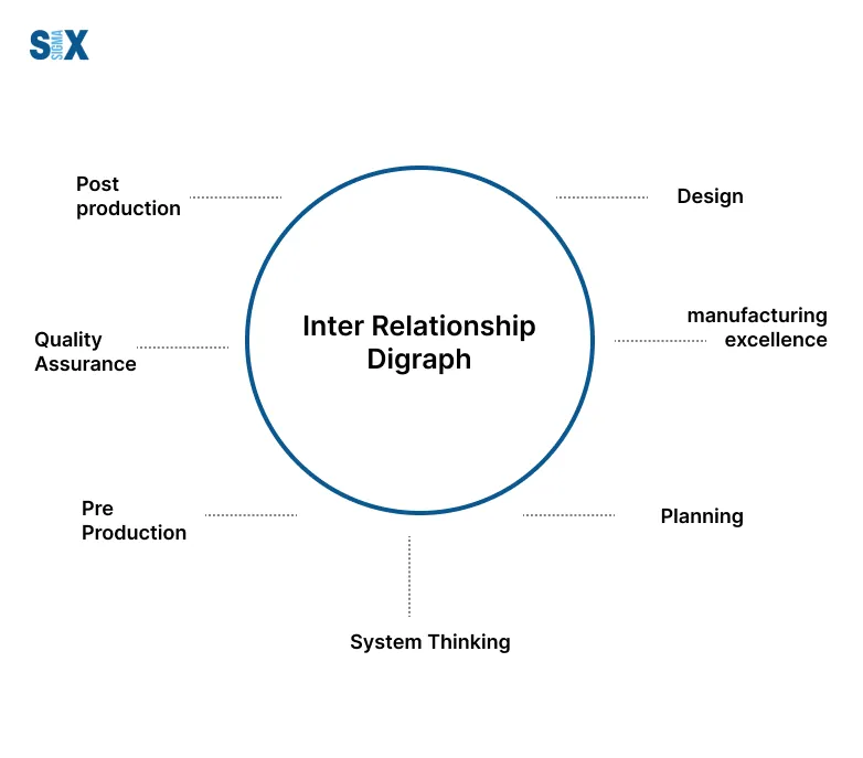
Systems Thinking
For complex, interconnected systems, interrelationship digraphs foster systems thinking. They enable teams to step back and visualize the bigger picture, understanding how different components interact and influence each other.
Project Planning
In project management, interrelationship digraphs can map out task dependencies, resource allocations, and potential risks or constraints. This supports more effective planning, scheduling, and risk mitigation.
Best Practices and Tips of Interrelationship Digraph
Constructing an effective interrelationship digraph requires following some key best practices and tips:
Clearly Define the Problem/Issue
Before creating the digraph, ensure you have clearly defined and articulated the core problem, issue, or process you are analyzing. Having a solid problem statement will help focus the scope of the digraph.
Involve a Cross-Functional Team
Interrelationship digraphs work best when created by a diverse team with different perspectives and expertise related to the issue at hand. This cross-functional input helps ensure a comprehensive analysis.
Use Affinity Diagramming First
It can be helpful to first map out potential causes and factors using an affinity diagram or brainstorming exercise. This allows you to visually organize the inputs before creating the interrelationships.
Start Simple
Try to capture only some of the possible relationships at first. Start with the core factors and build out the digraph in phases for better manageability.
Use Straightforward Symbols
Keep the digraph symbols straightforward and easy to interpret. Arrows, circles, etc. Avoid complex shapes that can confuse the meaning.
Review and Revise
Treat the initial digraph as a draft. Review, validate, and revise it continuously with the team to improve accuracy and completeness.
Software Tools
Consider using dedicated digraphing software to automatically layout, format and update the visual representation as it evolves.
Examples and Case Studies
Interrelationship digraphs can be applied to a wide variety of situations across different industries. Here are some examples and case studies that illustrate their use:
Manufacturing Process Improvement
An automotive manufacturer was having issues with excessive defects on one of their assembly lines.
They used an interrelationship digraph to map out all the potential factors that could be causing the defects, such as machine settings, worker training, material quality, etc. This visual representation helped them identify the key root causes and prioritize corrective actions.
Software Development with Interrelationship Digraph
When building a new software application, the development team used an interrelationship diagram to map out all the components, modules, and dependencies.
This allowed them to analyze areas of high complexity and risk before writing code. The diagram served as a blueprint to plan out the project tasks and timelines.
Supply Chain Analysis
A retail company utilized interrelationship digraphs to understand the relationships between different aspects of their supply chain network – suppliers, warehouses, transportation, inventory management, etc.
This systems-level view helped them optimize logistics and identify bottlenecks.
Root Cause of Delays with Interrelationship Digraph
An airline was experiencing frequent flight delays and used an interrelationship digraph to dissect all the potential contributing factors like air traffic, crew scheduling, maintenance, weather, etc.
This enabled them to zero in on the key root causes and take targeted measures to improve on-time performance.
New Product Development
During the design phase for a new product, the R&D team leveraged an interrelationship diagram to map out how different design choices and features could impact factors like cost, reliability, ease of manufacturing, and so on. This guided them in making trade-offs and optimal decisions.
SixSigma.us offers both Live Virtual classes as well as Online Self-Paced training. Most option includes access to the same great Master Black Belt instructors that teach our World Class in-person sessions. Sign-up today!
Virtual Classroom Training Programs Self-Paced Online Training Programs