Mastering Data Analysis Techniques: Your Key to Lean Six Sigma Project Success
Ever feel like your Lean Six Sigma projects are hitting a wall? Maybe progress stalls, bogged down by debates based on opinion rather than solid facts?
Or perhaps you’re swimming in process data but struggling to extract clear, actionable insights?
These common roadblocks don’t just slow things down; they represent real costs tied to persistent inefficiencies. Without the right approach, valuable improvement opportunities are missed.
Key Highlights
- Understanding the ‘Why’: The foundational role of data analysis in LSS.
- Qualitative vs. Quantitative: Navigating data types in LSS projects.
- DMAIC Toolkit: Exploring key techniques aligned with each phase.
- Smart Selection: A framework for choosing the right analysis method.
- Essential Software: Common tools used in LSS data analysis.
- Future Focus: Emerging trends like AI in LSS data analysis.
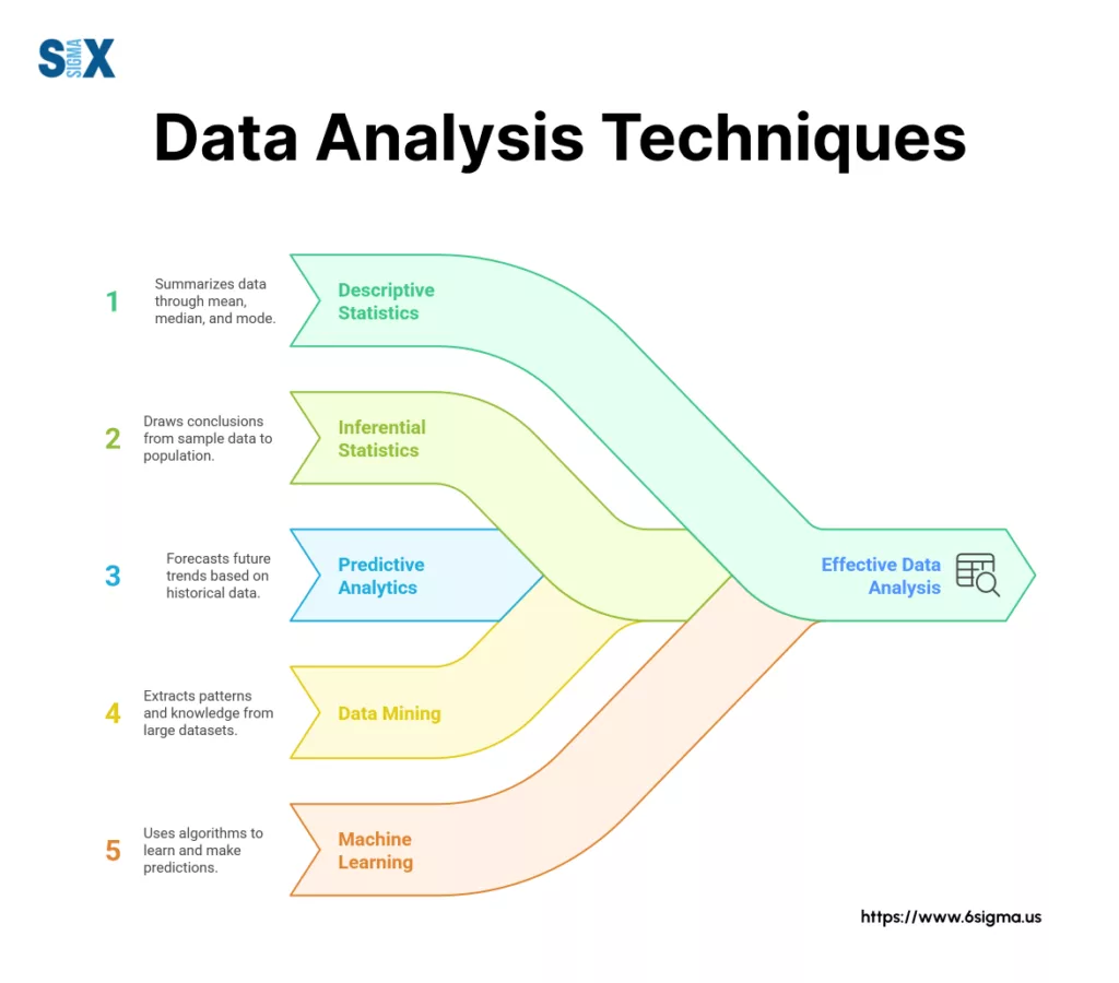
What Are Data Analysis Techniques?
In Lean Six Sigma, data analysis techniques are the systematic methods used to transform raw process data into actionable insights.
It’s about moving decisively beyond gut feelings, anecdotes, and “the way we’ve always done it” towards objective, evidence-based decision-making for genuine process improvement.
These techniques are the engine that drives successful Lean Six Sigma projects, enabling teams to effectively reduce waste, enhance quality, boost efficiency, and ultimately improve customer satisfaction.
Studies often show projects rigorously applying data analysis techniques have significantly higher success rates in achieving their goals.
Think of it this way: an opinion-based approach might guess at a problem’s cause, while a data-driven Lean Six Sigma approach uses specific techniques to prove it.
This ensures objectivity in problem validation, precision in root cause identification, confidence in solution verification, and reliability in control.
For instance, one team struggled for months debating the cause of production delays based on conflicting observations (opinion-based failure).
Another team, using simple cycle time analysis (a data analysis technique), quickly identified the true bottleneck in under a week, leading to a targeted, successful improvement (data-driven success).
Qualitative vs. Quantitative Techniques in Lean Six Sigma
In your Lean Six Sigma projects, you’ll encounter two fundamental types of data, each requiring different data analysis techniques. Understanding the distinction is crucial for effective problem-solving.
Qualitative data analysis techniques deal with non-numerical information – observations, descriptions, and context.
This often involves unstructured data analysis techniques to make sense of text or observations. Think about insights gathered from:
- Process maps visualizing workflow
- Notes from Gemba walks (going to see the work)
- Voice of the Customer (VOC) feedback from interviews or open-ended survey questions
- Brainstormed ideas captured in Fishbone diagrams
Quantitative data analysis techniques, conversely, focus on numerical, measurable data.
This is the realm of metrics and statistics, such as:
- Cycle times for process steps
- Defect rates (DPMO) or first-pass yield (FPY)
- Lead times from start to finish
- Measurements like temperature, pressure, or dimensions
- Customer satisfaction scores (e.g., NPS, CSAT ratings)
- Cost savings or operational expenses
Within the DMAIC framework, both play vital roles. Qualitative techniques are invaluable early on (Define, Measure, Analyze) for understanding the process context, identifying potential issues, and generating hypotheses.
Quantitative techniques are essential for establishing baseline performance (Measure), statistically validating root causes (Analyze), verifying the impact of improvements (Improve), and monitoring ongoing performance (Control).
They are complementary: qualitative insights often guide where to apply quantitative measurement.
| Feature | Qualitative Data Analysis Techniques | Quantitative Data Analysis Techniques |
| Data Type | Non-numerical, descriptive, observational | Numerical, measurable, statistical |
| LSS Examples | Process maps, Gemba notes, VOC interviews, Fishbone | Cycle time, Defect rates, Lead time, CSAT scores, Costs |
| Primary Purpose | Understanding context, generating ideas, exploring ‘why’ | Measuring performance, testing hypotheses, verifying impact |
| Key DMAIC Use | Define, Measure (context), Analyze (hypothesize) | Measure (baseline), Analyze (validate), Improve, Control |
Think about your own Lean Six Sigma projects – which types of data do you find yourself working with most often?
Recognizing both is the first step towards applying the right data analysis techniques.
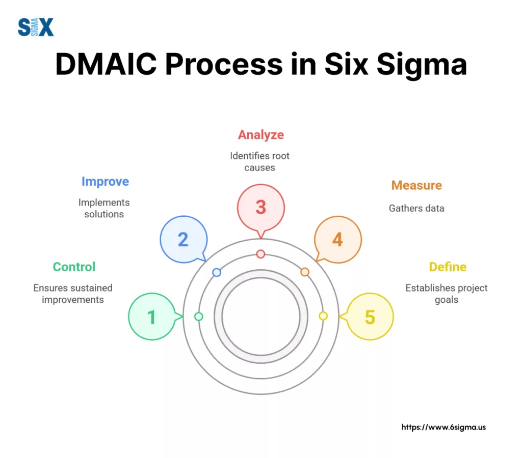
The Lean Six Sigma Data Toolkit: Key Techniques Across the DMAIC Phases
The DMAIC (Define, Measure, Analyze, Improve, Control) framework provides the structured roadmap for nearly all Lean Six Sigma projects.
Successfully navigating this roadmap hinges on applying the right data analysis techniques at the right time.
Ready to contribute effectively to improvement projects?
Master the foundational tools for mapping processes and identifying key variables discussed above with Yellow Belt Training & Certification.

Define & Measure: Setting the Stage with Descriptive Analysis
In the Define phase, you clarify the problem and project scope. In Measure, you establish a baseline understanding of the current process performance.
This is where descriptive analysis shines. Its purpose is to summarize and describe the basic features of your data, providing a clear picture of the “as-is” state.
Key statistical techniques for data analysis used here include:
- Measures of Central Tendency: Calculating the Mean (average), Median (middle value), and Mode (most frequent value) for key process metrics (like cycle time, error count) helps understand typical performance.
- Measures of Variation: Range (difference between highest and lowest) and Standard Deviation (average distance from the mean) quantify the spread or inconsistency in your process data. High variation is often a target for Lean Six Sigma projects.
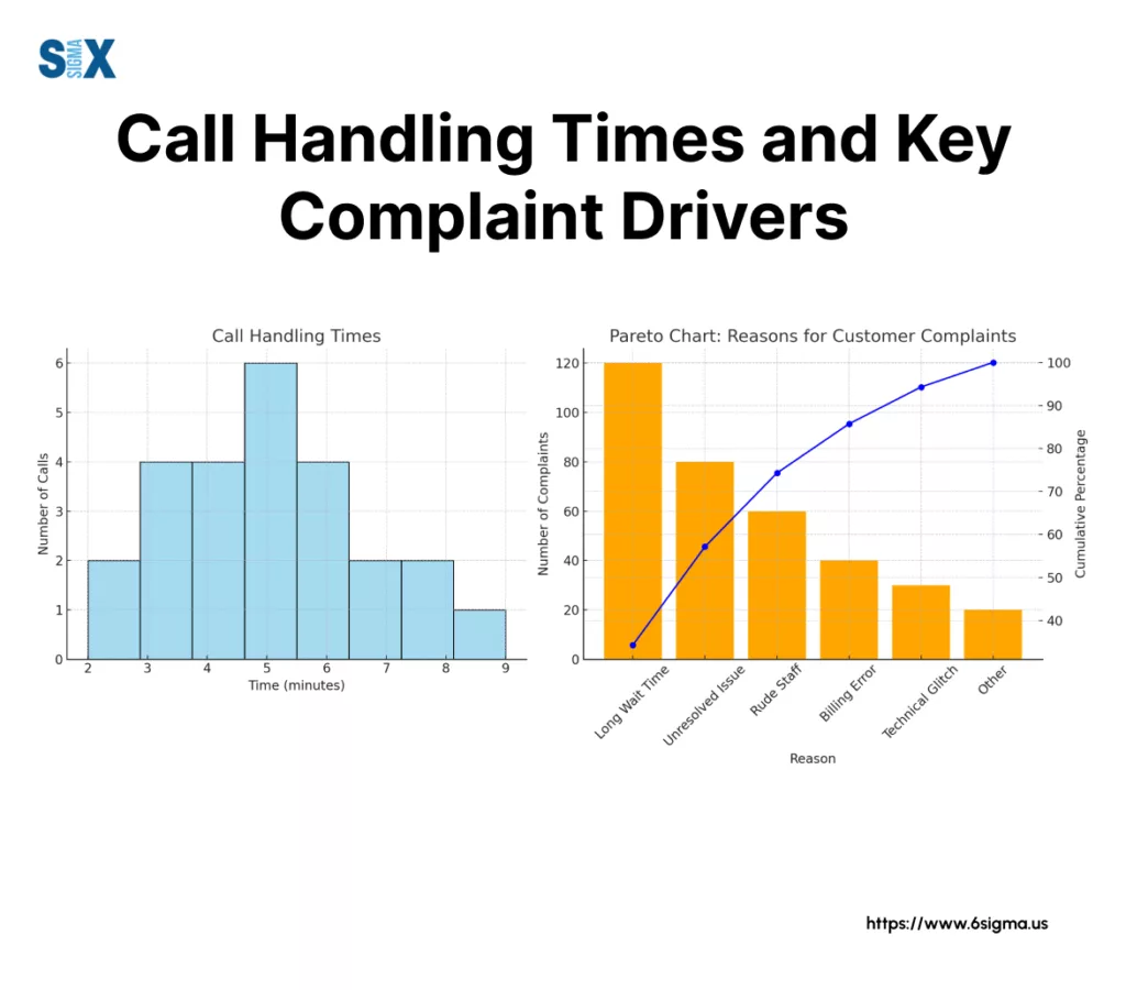
- Frequency Plots & Histograms: These visual tools show the distribution of your data. When to Use: Essential for visualizing cycle times, defect locations, or measurement data to see if it’s normally distributed or skewed, which informs later analysis choices.
- Pareto Charts: A specialized bar chart highlighting the “vital few” causes contributing to the majority of problems (the 80/20 rule). When to Use: Perfect for prioritizing efforts by identifying the biggest sources of defects, complaints, or delays early on.
- Basic Process Capability (Cp, Cpk): These metrics provide an initial snapshot of whether your process is capable of meeting customer specifications. When to Use: To quantitatively assess the current state’s ability to meet requirements in the Measure phase.
- LSS Example: A team measuring call handling time might calculate the mean and standard deviation to baseline performance. They could then use a Pareto Chart to find that 80% of long calls are related to just two complex inquiry types.
Analyze: Uncovering Root Causes with Statistical Techniques
Once you have baseline data, the Analyze phase focuses on exploring relationships, testing theories, and drilling down to the statistically validated root causes of the problem.
This often involves exploratory data analysis techniques and more rigorous statistical techniques for data analysis. Diagnostic analysis often heavily leverages these methods.
Key quantitative data analysis techniques include:
- Hypothesis Testing (e.g., T-tests, ANOVA): These are formal procedures to determine if there’s a statistically significant difference between groups. Purpose: To validate or reject potential root causes identified through brainstorming (like Fishbone diagrams) or process knowledge. When to Use: Comparing performance between two shifts (2-sample T-test), checking if a process change had a real impact (Paired T-test), or comparing performance across multiple machines (ANOVA).
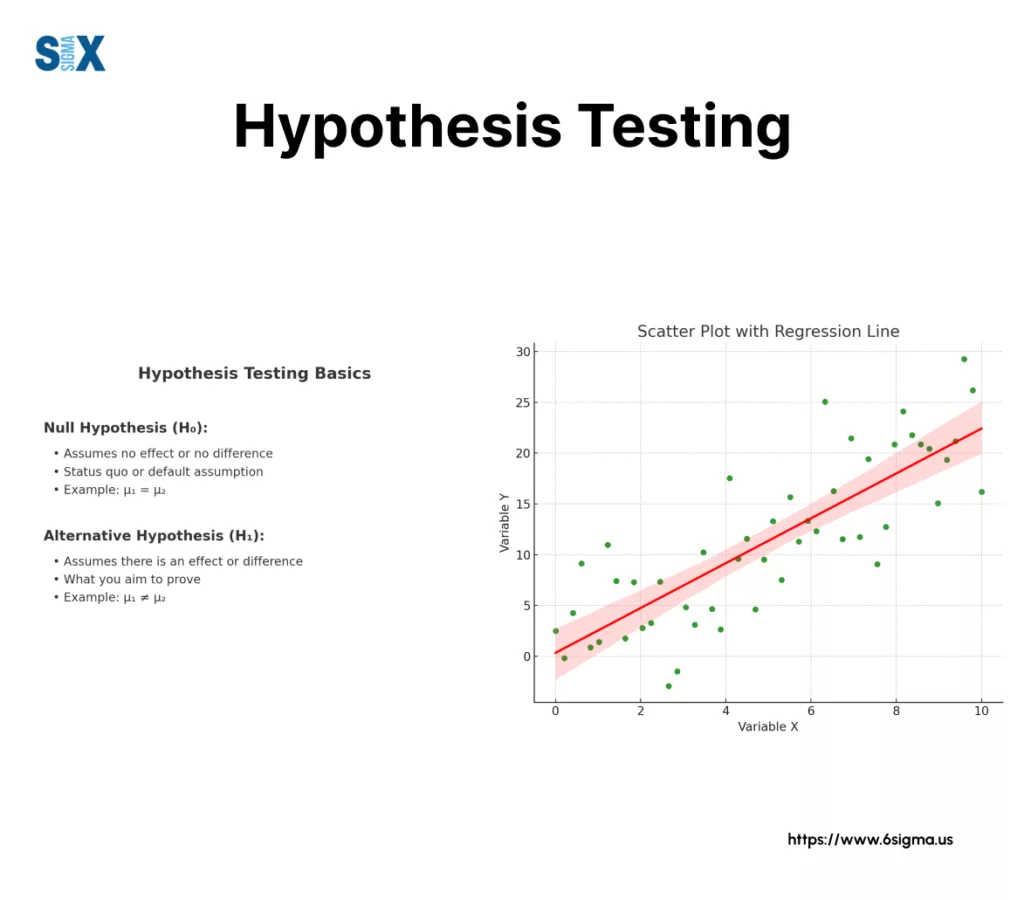
- Correlation Analysis: Measures the strength and direction of a linear relationship between two quantitative variables. Purpose: To see if variables tend to move together. When to Use: As an initial exploratory data analysis technique before diving into regression (e.g., Is there a correlation between machine speed and vibration level?). Caution: Correlation doesn’t equal causation!
- Regression Analysis: Goes beyond correlation to model the relationship between one or more input variables (Xs) and an output variable (Y). Purpose: To understand how changes in inputs affect the output and identify key drivers. When to Use: Quantifying the impact of factors like temperature or pressure on defect rates; predicting an outcome based on input settings.
- Example: A team hypothesizes that a new raw material supplier led to increased defects. They use a 2-sample T-test on defect data before and after the switch to statistically confirm if the difference is significant. They might then use regression analysis to determine which specific material property has the largest impact on the defect rate.
Get hands-on with the essential Define and Measure phase tools covered in our focused Green Belt Bootcamp.
Improve & Control: Verifying Solutions & Sustaining Gains
In the Improve phase, you develop and implement solutions targeting the validated root causes.
In Control, you establish systems to maintain the improved performance. Data analysis here focuses on verification and ongoing monitoring.
Key statistical techniques for data analysis are:
- Control Charts (Statistical Process Control – SPC): These are time-based charts used to monitor process performance and stability. Purpose: To distinguish between common cause (inherent process noise) and special cause (unexpected events) variation. When to Use: Crucial in the Control phase after improvements are made to ensure the process remains stable and gains are sustained. Different chart types (like I-MR, Xbar-R/S, P/NP, C/U) are used depending on the type of data (continuous vs. attribute, subgroup size).
- Design of Experiments (DOE): A powerful set of advanced data analysis techniques used primarily in the Improve phase. Purpose: To efficiently test multiple factors simultaneously to find the optimal process settings. When to Use: For complex problems where several variables might interact to influence the outcome.
- Lean Six Sigma Example: After implementing changes to reduce fill volume variation in a bottling process, the team institutes an Xbar-R Control Chart to monitor the average fill volume and variation over time, ensuring it stays within the new, tighter limits.
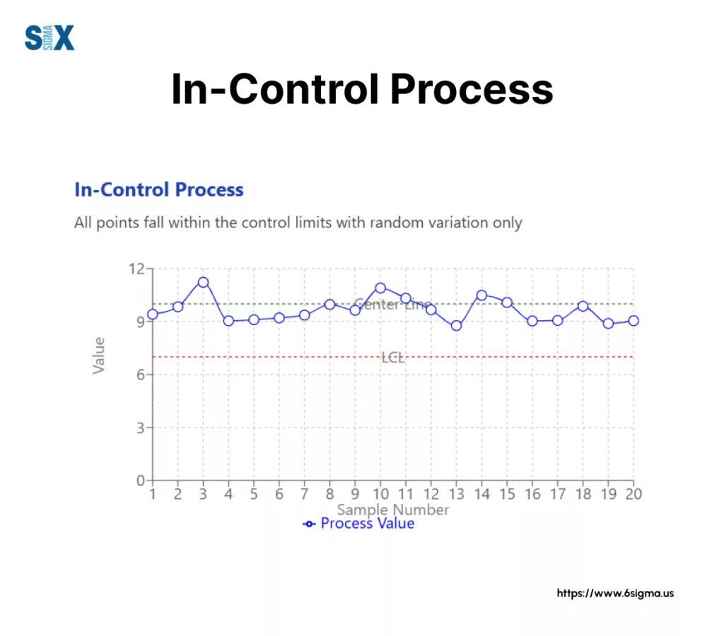
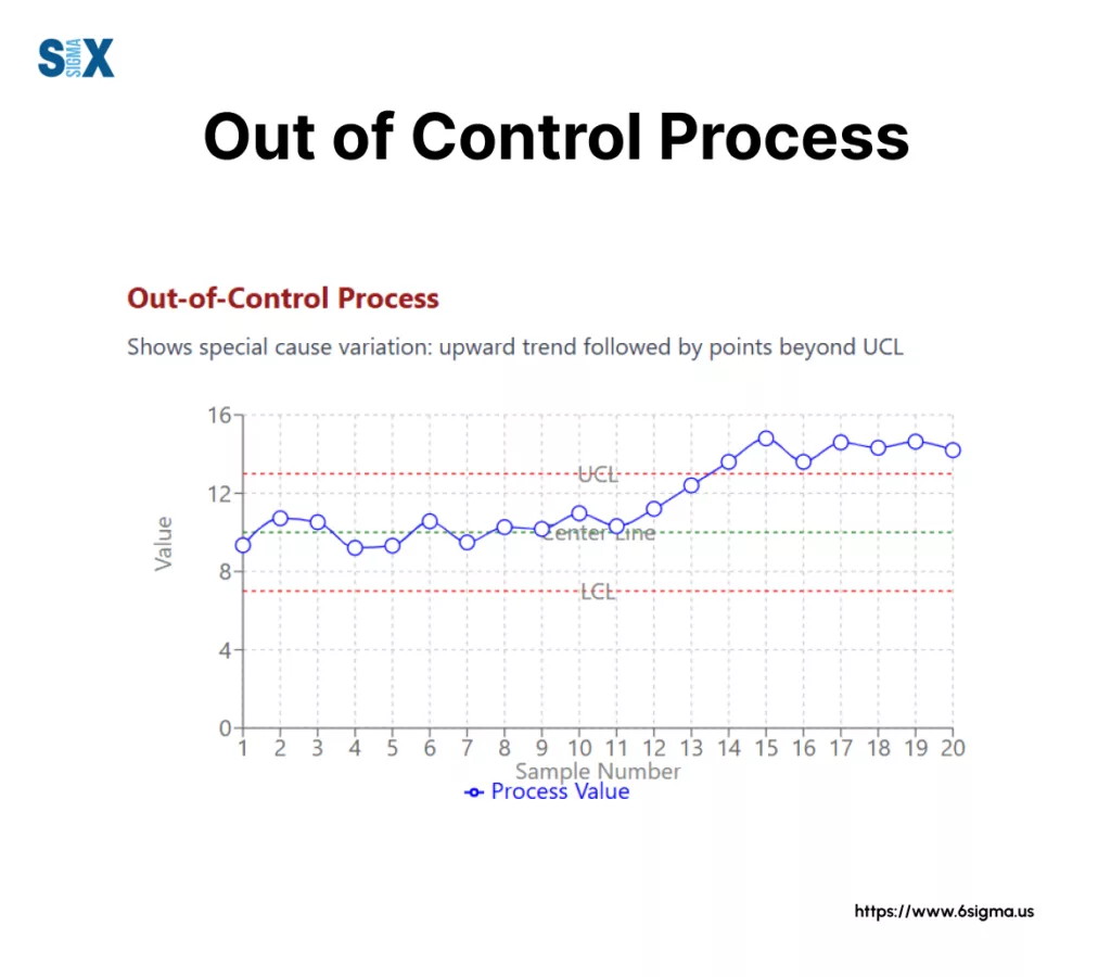
Key Elements of Control Charts:
- Center Line (CL): The average or mean of the process data
- Upper Control Limit (UCL): Typically set at 3 standard deviations above the center line
- Lower Control Limit (LCL): Typically set at 3 standard deviations below the center line
- Common Cause Variation: Random variation within control limits (top chart)
- Special Cause Variation: Non-random patterns or points outside limits indicating process issues (bottom chart)
Leveraging Qualitative Techniques Throughout DMAIC
While Lean Six Sigma heavily relies on quantitative data, qualitative data analysis techniques are indispensable complements throughout the DMAIC cycle.
They provide context, generate ideas, and help interpret quantitative findings.
Key qualitative tools and techniques include:
- Process Mapping (Value Stream Mapping): Visually documenting the steps in a process. When to Use: Define/Measure phase to understand the current state, identify potential bottlenecks, complexity, or non-value-added steps. Analyze phase to pinpoint areas for deeper investigation.
- Gemba Walks: Going to the actual place where work happens to observe directly. When to Use: Measure/Analyze phases to gain firsthand understanding, validate process maps, and uncover issues not apparent in data alone.
- Brainstorming Tools (Fishbone/Ishikawa Diagrams): Structured methods for generating potential causes for a problem. When to Use: Analyze phase to explore potential root causes before quantitative validation.
- Surveys & Interviews (Voice of the Customer – VOC): Gathering feedback and requirements directly from customers or stakeholders. When to Use: Define phase to understand requirements and problems; Measure phase to gather baseline satisfaction data. Analysis of open-ended responses uses unstructured data analysis techniques.
- 5 Whys: A simple iterative technique asking “Why?” repeatedly to drill down to a root cause. When to Use: Analyze phase for simpler problems or as a starting point.
- LSS Example: A team uses process mapping to visualize a lengthy approval process, identifying redundant steps. Gemba walks reveal operators are using inefficient workarounds not captured in procedures. A Fishbone diagram helps brainstorm potential causes for machine downtime before collecting data for hypothesis testing.
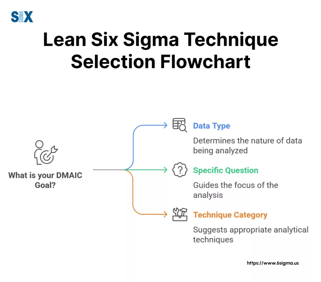
Choosing the Right Data Analysis Technique for Your Lean Six Sigma Project
With a diverse toolkit available, knowing which data analysis technique to use when can seem daunting. Selecting the wrong method can lead to wasted effort or incorrect conclusions.
The key is to align your technique choice with your specific objective within the Lean Six Sigma project lifecycle.
There’s no single “best” technique; the right choice depends on context.
Consider this simple framework to guide your selection:
- What is your DMAIC Phase & Goal? Are you trying to establish a baseline (Measure), identify root causes (Analyze), verify an improvement (Improve), or monitor stability (Control)? Your phase dictates the primary goal.
- What Type of Data Do You Have? Is your data quantitative (numerical) or qualitative (descriptive)? If quantitative, is it continuous (measurements like time, temperature) or discrete (counts like defects, yes/no)? Data type often restricts applicable statistical techniques for data analysis.
- What Specific Question Are You Asking? Do you need to summarize data (descriptive stats)? Compare performance between two groups (hypothesis test)? Understand relationships between variables (correlation/regression)? Or track performance over time (control chart)? Your precise question points towards the most relevant technique.
Always align the chosen technique with your objective and be mindful of your data’s limitations (e.g., sample size, collection method).
Essential Tools for Lean Six Sigma Data Analysis
Applying many of these data analysis techniques, especially the more complex statistical techniques for data analysis, requires the right software.
While manual calculations are possible for basics, specialized tools significantly enhance efficiency and accuracy. Common data analysis tools and techniques software used in Lean Six Sigma contexts include:
- Minitab: Widely considered the industry standard for Lean Six Sigma practitioners. Its menus are often structured around DMAIC and specific statistical tools like Control Charts, Capability Analysis, and Hypothesis Tests, making it very user-friendly for LSS projects.
- Microsoft Excel: Highly accessible and capable of basic descriptive statistics, charting, and even some statistical tests (using the free Analysis ToolPak add-in). It’s excellent for initial data organization and simpler analyses.
- JMP: Another powerful statistical discovery software package from SAS, offering strong visualization and analytical capabilities often used in LSS.
- (Optional) R / Python: Open-source programming languages with extensive statistical libraries, increasingly used for more complex or custom advanced data analysis techniques, though requiring programming skills.
The best tool often depends on the complexity of the analysis needed, your organization’s standards, budget, and user familiarity.
For instance, generating detailed Control Charts or running Regression analysis is often streamlined in Minitab or JMP compared to Excel.
Move beyond describing problems to statistically proving root causes with Hypothesis Testing!
Equip yourself with the analytical power with
Green Belt Training & Certification

Overcoming Common Challenges in Lean Six Sigma Data Analysis
While powerful, effectively applying data analysis techniques in Lean Six Sigma projects isn’t always a smooth ride.
Teams often encounter specific hurdles that can derail progress if not anticipated and managed. Recognizing these common challenges is the first step to overcoming them:
- Data Quality & Availability: Perhaps the most frequent issue is dealing with messy, incomplete, inaccurate, or simply non-existent operational data. Poor data leads to unreliable analysis.
- Lack of Statistical Knowledge: Team members, particularly Green Belts or project participants, may not have the necessary statistical background to confidently apply or interpret certain techniques.
- Resistance to Data: Sometimes, there’s cultural resistance to data-driven decisions, with individuals preferring anecdotes or fearing what objective data might reveal about performance.
- Choosing Incorrect Techniques: Without proper understanding, teams might misapply a statistical test or analysis method, leading to flawed conclusions and misguided actions.
Addressing these requires proactive effort. Rigorous data collection planning during the Measure phase is crucial for ensuring quality data.
Providing adequate training and support, often facilitated by a Black Belt or Master Black Belt, bridges the knowledge gap.
Clear communication about the purpose and benefits of data analysis can help overcome resistance.
The Future is Data-Driven: AI and Advanced Techniques in Lean Six Sigma
The landscape of data analysis techniques is constantly evolving, particularly with the rise of Artificial Intelligence (AI) and Machine Learning (ML).
While the foundational Lean Six Sigma methods discussed remain essential, awareness of advanced data analysis techniques is increasingly valuable.
AI data analysis techniques are beginning to play a role in automating complex analyses, enabling predictive maintenance based on sensor data, and uncovering subtle patterns in vast operational datasets that might be missed by traditional methods.
This offers exciting potential for enhancing Lean Six Sigma outcomes through deeper insights, predictive capabilities, and faster analysis cycles.
Understanding the basics is key, but keeping an eye on these advancements will be beneficial for future process improvement leaders.
Learn to create powerful charts and perform key analyses efficiently using Minitab.
Road Ahead
Successfully executing Lean Six Sigma projects hinges on moving beyond assumptions and embracing objective insights.
As we’ve explored, understanding and correctly applying various data analysis techniques – from descriptive statistics and qualitative tools in the early phases to hypothesis testing and control charts later in the DMAIC cycle – is not just beneficial, it’s fundamental.
Careful selection, matching the technique to your specific data and project goal, is paramount.
Mastering these data analysis techniques truly transforms Lean Six Sigma initiatives, elevating them from guesswork exercises to predictable pathways for achieving significant, sustainable process improvements.
SixSigma.us offers both Live Virtual classes as well as Online Self-Paced training. Most option includes access to the same great Master Black Belt instructors that teach our World Class in-person sessions. Sign-up today!
Virtual Classroom Training Programs Self-Paced Online Training Programs