Box and Whisker Plots: Understanding, Creating, and Interpreting Data Visualization
Box and whisker plots serve as powerful statistical tools that display data distribution through quartiles.
These visual representations help analysts and researchers understand how numerical data spreads across different ranges.
Originally developed by statistician John Tukey in 1977, box and whisker plots quickly became essential in data analysis due to their ability to show multiple statistical measures in a single view.
Key Elements of This Guide
- Learn to create accurate box plots
- Master data interpretation techniques
- Explore real-world applications
- Understand statistical quartiles
Components of Box and Whisker Plots
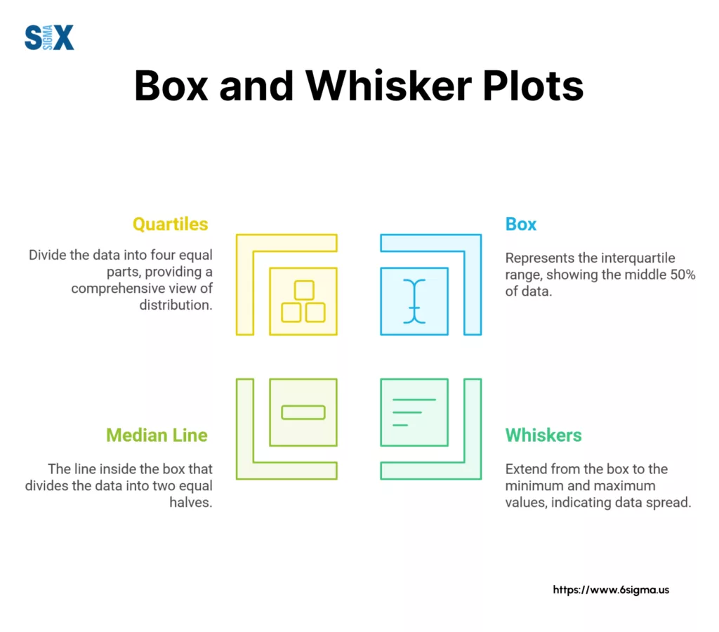
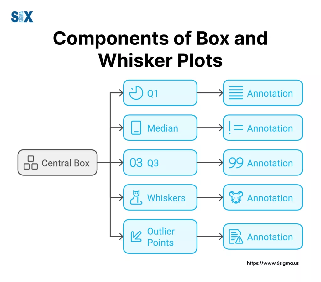
Box and whisker plots display five key statistical values that tell the story of data distribution.
Each element serves a specific purpose in showing how numbers spread across a range, making these plots valuable for both basic and advanced statistical analysis.
The Box: Understanding the Middle Ground
The rectangular box in box and whisker plots represents where most data points cluster. This box captures the middle 50% of all values in the dataset.
Two important lines divide this box: the lower quartile (Q1) marks the 25th percentile, while the upper quartile (Q3) shows the 75th percentile.
The distance between these quartiles, known as the interquartile range (IQR), helps measure data spread.
The Median Line: Center of Distribution
A bold line crosses the box to mark the median value. This line splits the data exactly in half – 50% of values fall above it, and 50% below.
The median’s position within the box reveals important clues about data skewness. When the median sits closer to one end of the box, it suggests the data leans toward that direction.
The Whiskers: Extending the Range
Two lines extend from both ends of the box, forming the “whiskers” in box and whisker plots.
These whiskers stretch to the smallest and largest values within 1.5 times the IQR. The whisker length often varies between datasets, offering insights into data spread beyond the central box.
Outliers: Points Beyond the Norm
Any values falling beyond the whiskers appear as individual points. These outliers represent unusual values in the dataset.
While some might view outliers as errors, they often highlight important exceptions or special cases worth investigating. In medical research, for example, outliers might indicate unique patient responses to treatment.
The Interquartile Range (IQR)
The IQR measures statistical dispersion by calculating the range between Q1 and Q3.
This measurement proves especially useful when identifying outliers and understanding data variability.
A larger IQR indicates more spread in the middle 50% of the data, while a smaller IQR suggests the data clusters more tightly around the median.
These components work together in box and whisker plots to provide quick insights into data distribution.
Whether analyzing student test scores or market trends, understanding these elements helps readers extract meaningful information from their data.
Master the fundamentals of data visualization and statistical analysis with our comprehensive training program.
Creating Box and Whisker Plots
Creating box and whisker plots requires organizing data systematically to reveal important statistical insights.
Whether using manual calculations or digital tools, the process follows specific steps to ensure accurate visualization of data distribution.
Manual Method: Step-By-Step Process
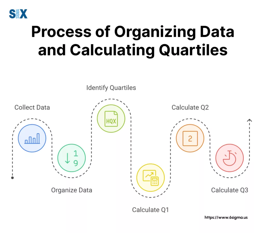
The manual creation of box and whisker plots starts with organizing numerical data in ascending order.
Next, calculate the five key statistical values: minimum, first quartile (Q1), median, third quartile (Q3), and maximum.
To find these values:
- Sort all numbers from lowest to highest
- Locate the median by finding the middle number
- Find Q1 by calculating the median of the lower half
- Find Q3 by calculating the median of the upper half
- Mark the minimum and maximum values
Drawing The Box and Whiskter Plot By Hand
Once you have calculated the necessary values, draw the plot on graph paper:
- Draw a vertical or horizontal scale based on your data range
- Mark the five calculated points on your scale
- Draw the box between Q1 and Q3
- Add the median line inside the box
- Extend the whiskers to the minimum and maximum values
Using Excel For Box and Whisker Plots
Microsoft Excel offers built-in tools for creating box and whisker plots. Start by selecting your data range, then:
- Click the ‘Insert’ tab
- Navigate to ‘Statistical Charts’
- Select ‘Box and Whisker’
- Customize the plot using Excel’s formatting options
Advanced Software Solutions
For more detailed analysis, statistical software packages provide additional features:
Python with Matplotlib:
import matplotlib.pyplot as plt
plt.boxplot(data)
plt.show()
R Programming:
boxplot(data, main="Box and Whisker Plot")These tools offer greater flexibility in customization and can handle larger datasets efficiently.
Common Software Tools
Different tools serve various needs:
- Excel: Best for basic analysis and business applications
- Python: Ideal for data scientists and programmers
- R: Preferred by statisticians and researchers
- Tableau: Perfect for interactive visualizations
- SPSS: Used mainly in academic and research settings
Tips For Clean Visualization with Box and Whisker Plots
Creating clear box and whisker plots requires attention to detail. Use appropriate scaling for your data range. Add clear labels to all components.
Choose contrasting colors or patterns to distinguish different data groups when comparing multiple plots.
Avoiding Common Mistakes
Several pitfalls can affect the accuracy of box and whisker plots:
- Incorrect calculation of quartiles
- Misplaced median lines
- Wrong scale selection
- Overlooked outliers
Understanding these elements ensures the creation of accurate and meaningful box and whisker plots that effectively communicate data patterns to viewers.
Turn theory into practice – Learn how to create professional box plots using industry-standard tools
Interpreting Box and Whisker Plots
Reading box and whisker plots reveals important patterns in data distribution that might otherwise remain hidden in raw numbers.
These visual tools tell stories about data spread, central tendency, and unusual values through their various components.
Reading Data Distribution
The shape of a box and whisker plot immediately shows how data spreads across its range. A longer box indicates greater variability in the middle 50% of the data.
When the median line sits off-center within the box, it signals skewed distribution. The position of this line helps identify whether data leans toward higher or lower values.
Short whiskers paired with a small box suggest tightly clustered data points. Conversely, long whiskers indicate wide data spread.
These features help analysts quickly grasp the overall data pattern without diving into complex calculations.
Spotting Data Skewness
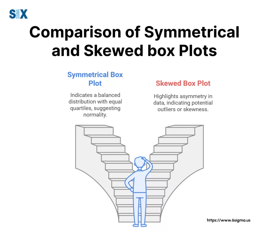
Skewness becomes apparent through several visual cues in box and whisker plots. When one whisker extends longer than the other, it indicates asymmetric data distribution.
A median line closer to Q1 suggests positive skewness, while proximity to Q3 indicates negative skewness. This information proves valuable when deciding which statistical tests suit the data.
Identifying And Understanding Outliers
Outliers appear as individual points beyond the whiskers. These points warrant special attention as they might represent:
- Data entry errors requiring correction
- Unusual but valid observations
- Interesting cases deserving further study
- Potential breakthrough discoveries
Comparing Multiple Datasets with Box and Whisker Plots
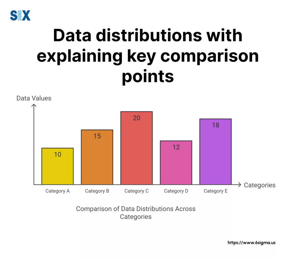
Box and whisker plots excel at comparing different groups of data. When placed side by side, these plots reveal:
- The relative position of medians shows central tendencies
- Box size differences indicate varying data spread
- Whisker length comparisons reveal overall range differences
- Overlapping boxes suggest similar distributions
Making Statistical Inferences
The plots provide quick insights into statistical significance. Non-overlapping boxes often indicate meaningful differences between groups.
The position of median lines helps assess whether differences between datasets likely occurred by chance or represent genuine variations.
Common Interpretation Challenges
Several factors can complicate box and whisker plot interpretation:
- Small sample sizes might not show true distribution
- Multiple outliers can distort whisker placement
- Rounded data might create artificial patterns
- Different plotting methods might yield slightly different results
Practical Applications of Box and Whisker Plots
Different fields use box and whisker plots for varied purposes:
- Medical Research: Compare treatment outcomes
- Education: Analyze test scores across classes
- Manufacturing: Monitor quality control measures
- Finance: Study investment returns
Understanding these interpretation techniques helps readers extract maximum value from box and whisker plots, leading to better-informed decisions based on data patterns.
Join industry professionals and learn advanced data interpretation techniques
Advantages and Disadvantages of Box and Whisker Plots
Box and whisker plots offer unique benefits in data visualization while also carrying certain limitations.
Understanding these strengths and weaknesses helps analysts choose the right visualization method for their specific needs.
Key Strengths of Box Plots
Box and whisker plots excel at displaying large datasets in a compact format. They quickly reveal data distribution patterns, making them invaluable for initial data exploration.
The simple visual structure allows viewers to grasp key statistical measures like median, quartiles, and outliers at a glance.
These plots prove especially useful when comparing multiple groups of data side by side.
Researchers often use them to contrast different experimental conditions, while business analysts employ them to examine performance metrics across departments or time periods.
Ideal Use Cases of Box and Whisker Plots
Several scenarios particularly benefit from box and whisker plots:
- Analyzing test score distributions across different classes
- Comparing sales performance between regions
- Examining patient outcomes in medical trials
- Evaluating manufacturing quality control data
- Studying environmental measurements over time
Limitations To Consider
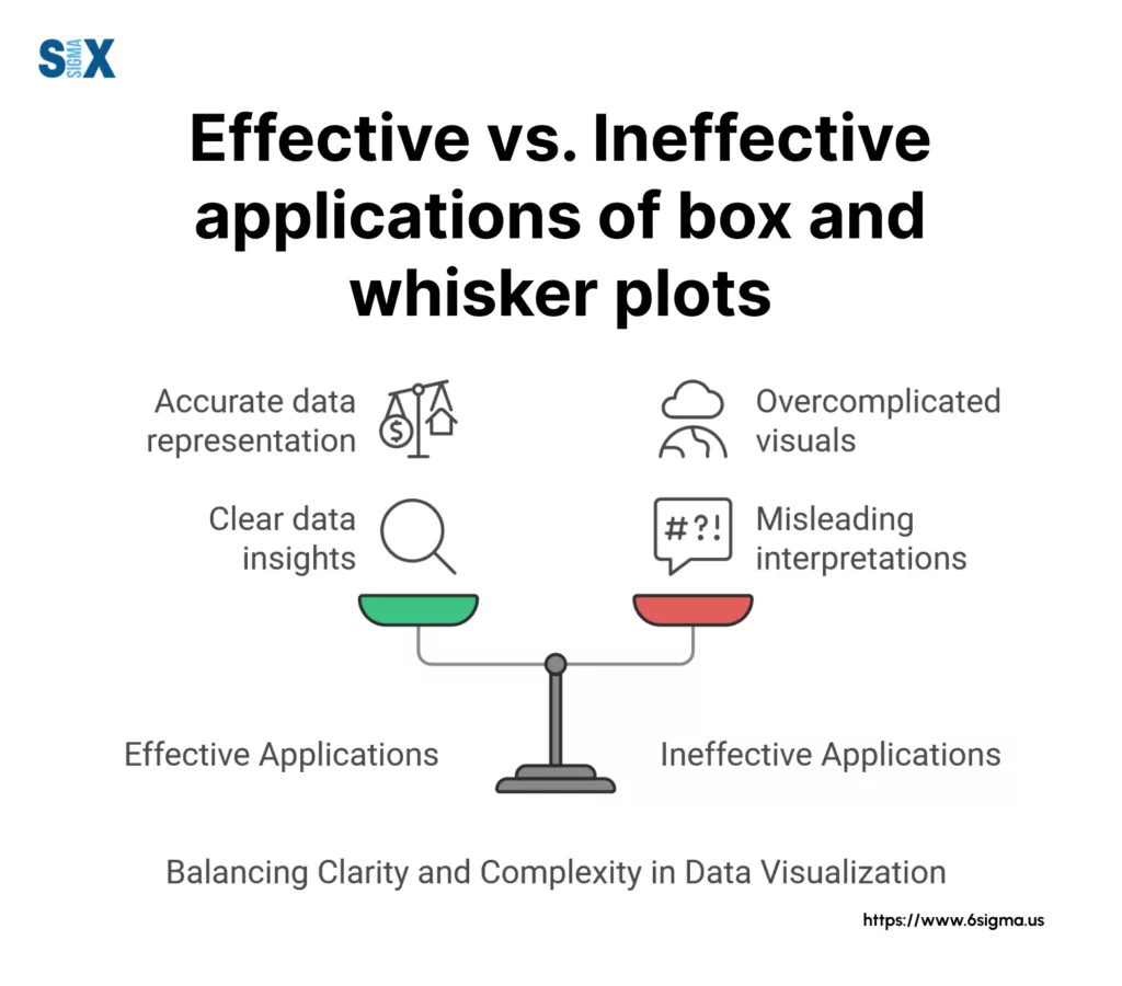
Despite their utility, box and whisker plots face certain constraints. They mask the exact distribution shape within each quarter of the data.
Small sample sizes might not provide meaningful quartile information, potentially leading to misleading visualizations.
The plots also hide multi-modal distributions. When data clusters around multiple values, a box and whisker plot might suggest a more uniform distribution than actually exists.
This limitation becomes particularly important in complex datasets where pattern details matter.
Alternative Visualization Methods
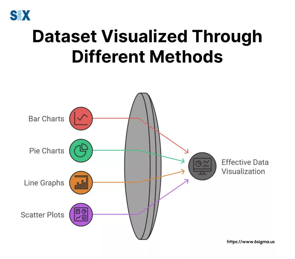
Different visualization tools serve various purposes:
- Histograms: Show frequency distribution details
- Scatter plots: Display relationships between variables
- Violin plots: Combine box plot features with distribution shape
- Dot plots: Present individual data points clearly
Choosing The Right Tool
Several factors influence the choice of visualization method:
- Data size and complexity
- Analysis goals
- Audience technical expertise
- Presentation context
- Time constraints
Enhancing Box Plot Effectiveness
While box and whisker plots have limitations, several techniques can maximize their utility:
- Adding color coding for different categories
- Including individual data points alongside the box
- Combining with complementary visualizations
- Using interactive features in digital formats
Common Misconceptions of Box and Whisker Plots
Users sometimes misunderstand certain aspects of box and whisker plots:
- Whiskers don’t always represent the full data range
- Outliers might be valid data points, not errors
- Box size alone doesn’t indicate sample size
- Median position reveals distribution skewness
Understanding these advantages and limitations helps users make informed decisions about when to use box and whisker plots versus other visualization methods.
This knowledge ensures effective data communication while avoiding potential misinterpretation.
Take your data analysis skills to the next level with our practical Minitab training.
The Role of Box and Whisker Plots in Modern Data Analysis
Box and whisker plots remain essential tools in statistical analysis and data visualization.
These versatile diagrams enable analysts, researchers, and students to understand complex datasets through clear visual representation.
Their ability to display key statistical measures while highlighting data distribution patterns makes them invaluable across numerous fields.
Key Applications of Box and Whisker Plots in Different Fields
The education sector uses box and whisker plots to analyze student performance and identify learning gaps. Business analysts rely on these visualizations to track sales patterns and market trends.
Medical researchers employ them to study treatment outcomes and patient data. Environmental scientists utilize these plots to examine climate patterns and ecological variations.
Future Directions
The growing importance of data visualization suggests an expanding role for box and whisker plots.
New applications continue to emerge in fields like artificial intelligence, where these plots help interpret model behavior and performance metrics.
Impact on Decision Making
Box and whisker plots transform raw numbers into actionable insights. They help decision-makers identify trends, spot anomalies, and compare groups effectively.
Whether in academic research, business analysis, or scientific study, these visualizations provide crucial support for evidence-based conclusions.
The enduring value of box and whisker plots lies in their blend of simplicity and statistical power.
They offer clear insights for beginners while providing sophisticated analysis tools for experts.
As data continues to drive modern decision-making, these plots will remain fundamental to understanding and communicating numerical information effectively.
SixSigma.us offers both Live Virtual classes as well as Online Self-Paced training. Most option includes access to the same great Master Black Belt instructors that teach our World Class in-person sessions. Sign-up today!
Virtual Classroom Training Programs Self-Paced Online Training Programs


