The 7 Quality Control Tools: A Comprehensive Guide for Quality Excellence
Quality proves pivotal for organizational endurance and success. Whether a seasoned quality guiding hand or a newcomer to the field, the 7 Quality Control tools stand as treasured companions to advance one’s abilities.
Esteemed quality pioneer Kaoru Ishikawa unveiled these 7 tools amid Japan’s post-war awakening, fashioning statistical quality principles accessible for all experiences and enabling company-wide effectiveness.
Graphical techniques help pinpoint, unravel, and solve quality matters, the 7 tools offer structured, evidence-guided approaches for problem-solving, process refinement, and decision-making.
Teams thus steer confidently by comprehension over assumption or intuition.
For quality stewards dedicated to performance-boosting and relationship-building, pursuing a Six Sigma certification can deepen their ability to apply these tools within structured methodologies, enhancing both individual and organizational outcomes.
This discussion explores each technique’s nuanced gifts, illuminating their staying power for continual optimization wherever quality matters most.
Key Highlights
- Understand the historical context and significance of the 7 quality control tools, and how they revolutionized Japan’s industrial resurgence after World War II.
- Gain in-depth knowledge of each of the 7 tools
- Cause-and-Effect Diagram (Fishbone/Ishikawa Diagram)
- Check Sheets (Tally Sheets)
- Control Charts (Shewhart Charts)
- Histograms
- Pareto Charts
- Scatter Diagrams
- Stratification (Flowcharts/Run Charts)
- Learn best practices for creating, interpreting, and effectively using each of these tools, with step-by-step guidance and industry-proven techniques.
- Explore case studies and success stories that showcase the powerful impact of integrating the 7 quality control tools.
- Discover strategies for seamlessly incorporating these tools into your organization’s problem-solving and continuous improvement efforts, fostering a data-driven culture of excellence.
- Gain insights into the future of quality control tools in the digital age and how they can be adapted to meet the evolving needs of modern businesses.
Introduction to the 7 Quality Control Tools
Where quality is the cornerstone of success, the 7 quality control tools stand as indispensable allies for organizations seeking to achieve and sustain excellence.
These tools, collectively known as the 7 QC tools, are a set of graphical techniques designed to simplify the intricate concepts of statistical quality control, making them accessible to professionals across various industries and backgrounds.
Definition and overview of the 7 quality control tools
The 7 quality control tools encompass a comprehensive suite of techniques that empower organizations to identify, analyze, and solve quality-related issues with precision and efficiency.
Each tool serves a specific purpose, providing a structured and data-driven approach to problem-solving, process improvement, and decision-making, enabling teams to make informed choices based on evidence rather than guesswork or intuition.
Historical background and importance
The origins of the 7 quality control tools can be traced back to the post-war era in Japan, where the esteemed Kaoru Ishikawa, a pioneer in the field of quality management, recognized the need to simplify the complex concepts of statistical quality control.
During this pivotal period, Japanese organizations were focused on training their workforce in these advanced techniques but soon realized that the inherent complexity could intimidate and deter many workers from embracing these methodologies effectively.
Ishikawa’s visionary solution was to introduce the 7 quality control tools, which distilled the essence of statistical quality control into a set of user-friendly, graphical techniques.
These tools later became foundational in modern quality frameworks like Six Sigma, where Six Sigma certification programs teach professionals to leverage them for data-driven problem-solving.
Benefits of using the 7 quality control tools
The adoption of the 7 quality control tools offers numerous benefits to organizations committed to continuous improvement and customer satisfaction.
These tools facilitate:
Effective Problem-Solving: By providing a structured framework for identifying root causes, analyzing data, and visualizing relationships, the 7 QC tools equip teams with the necessary insights to address quality issues effectively.
Process Improvement: Through data-driven analysis and monitoring, these tools enable organizations to identify areas for improvement, streamline processes, and eliminate inefficiencies, ultimately enhancing productivity and reducing waste.
Data-driven Decision Making: The 7 quality control tools empower teams to base their decisions on objective data and statistical analysis, minimizing the risk of biases or unfounded assumptions, and leading to more informed and effective decision-making processes.
The 7 Quality Control Tools Explained
1. Cause-and-Effect Diagram (Fishbone Diagram)
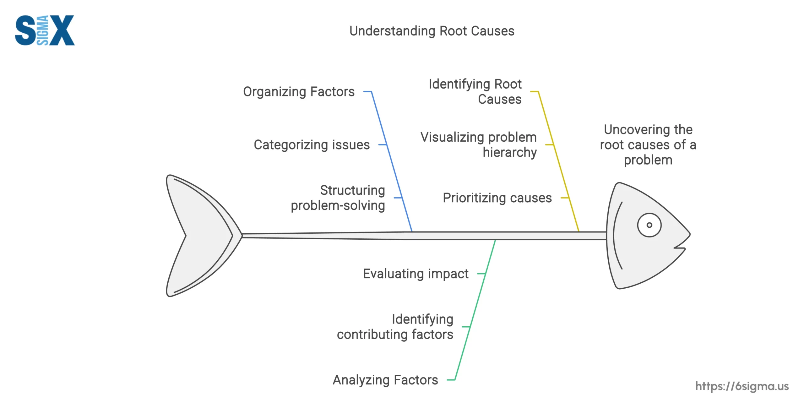
The Cause-and-Effect Diagram, also known as the Fishbone Diagram or Ishikawa Diagram, is a powerful tool designed to facilitate root cause analysis and identify potential causes contributing to a specific problem or effect.
Named after its creator, Kaoru Ishikawa, this diagram visually represents the relationship between an effect and its potential causes, resembling the skeletal structure of a fish.
The primary purpose of the Cause-and-Effect Diagram is to systematically explore and organize the various factors that could potentially contribute to a particular issue or outcome.
Teams trained in root cause analysis training often excel at using Fishbone Diagrams to systematically trace issues to their source.”
How to create and use a cause-and-effect diagram
Creating an effective Cause-and-Effect Diagram involves the following steps:
- Define the problem or effect: Clearly state the issue or outcome you wish to analyze, which will be represented as the “fish head” on the diagram.
- Identify the main cause categories: Determine the primary categories or broad areas that could potentially contribute to the problem, such as materials, methods, machinery, environment, or personnel. These categories will form the “bones” or main branches of the fishbone diagram.
- Brainstorm potential causes: For each main category, engage in a structured brainstorming session to identify specific potential causes or contributing factors. These sub-causes will be represented as smaller “bones” branching off from the main categories.
- Analyze and prioritize causes: Once all potential causes have been identified, analyze the diagram to determine which causes are most likely to be contributing to the problem. Prioritize these causes based on their perceived impact or likelihood of occurrence.
- Develop and implement countermeasures: Based on the prioritized causes, develop and implement targeted countermeasures or corrective actions to address the root causes and mitigate the problem effectively.
2. Check Sheets (Tally Sheets)
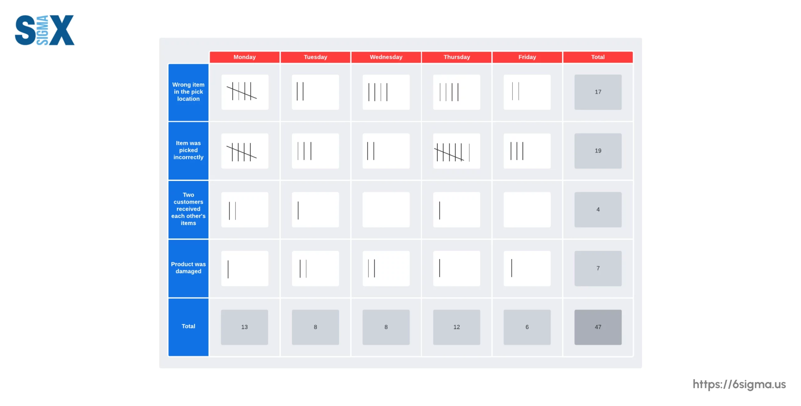
Check sheets, also known as tally sheets, are straightforward yet powerful tools designed to facilitate the systematic collection and organization of data related to quality issues, defects, or process performance.
These sheets serve as a structured means of recording and tabulating data, enabling organizations to identify patterns, trends, and areas for improvement.
The primary purpose of check sheets is to streamline the process of data collection and analysis, allowing teams to gather quantitative or qualitative information consistently and efficiently.
Types of check sheets
Check sheets can be categorized into three main types, each serving a specific purpose:
- Defect Location Check Sheets: These sheets are designed to record the location or specific area where a defect or issue occurred, providing valuable insights into potential problem areas or hotspots within a process.
- Tally Check Sheets: As the name implies, tally check sheets are used to record the frequency or occurrences of specific events, defects, or phenomena. These sheets typically feature a simple tally or check mark system, making it easy to quickly capture and quantify data.
- Defect Cause Check Sheets: These sheets are particularly useful for identifying and categorizing the potential causes or contributing factors associated with observed defects or issues. By capturing this information, organizations can gain valuable insights into the root causes underlying quality problems.
How to create and use check sheets
Creating and utilizing check sheets involves the following steps:
- Identify the data to be collected: Determine the specific information or metrics that need to be captured, such as defect types, locations, frequencies, or potential causes.
- Design the check sheet: Based on the identified data requirements, create a structured check sheet with appropriate columns or sections for recording the relevant information. Ensure that the sheet is user-friendly and easy to understand for those responsible for data collection.
- Train data collectors: Provide clear instructions and training to the individuals responsible for collecting data, ensuring they understand the purpose of the check sheet and the proper methods for recording information.
- Collect data: Implement the check sheet in the relevant areas or processes, and consistently record data as it becomes available or as events occur.
- Analyze and interpret data: Once sufficient data has been collected, analyze the check sheet for patterns, trends, or areas of concern. Use the information gathered to identify opportunities for improvement or further investigation.
3. Control Chart (Shewhart Chart)
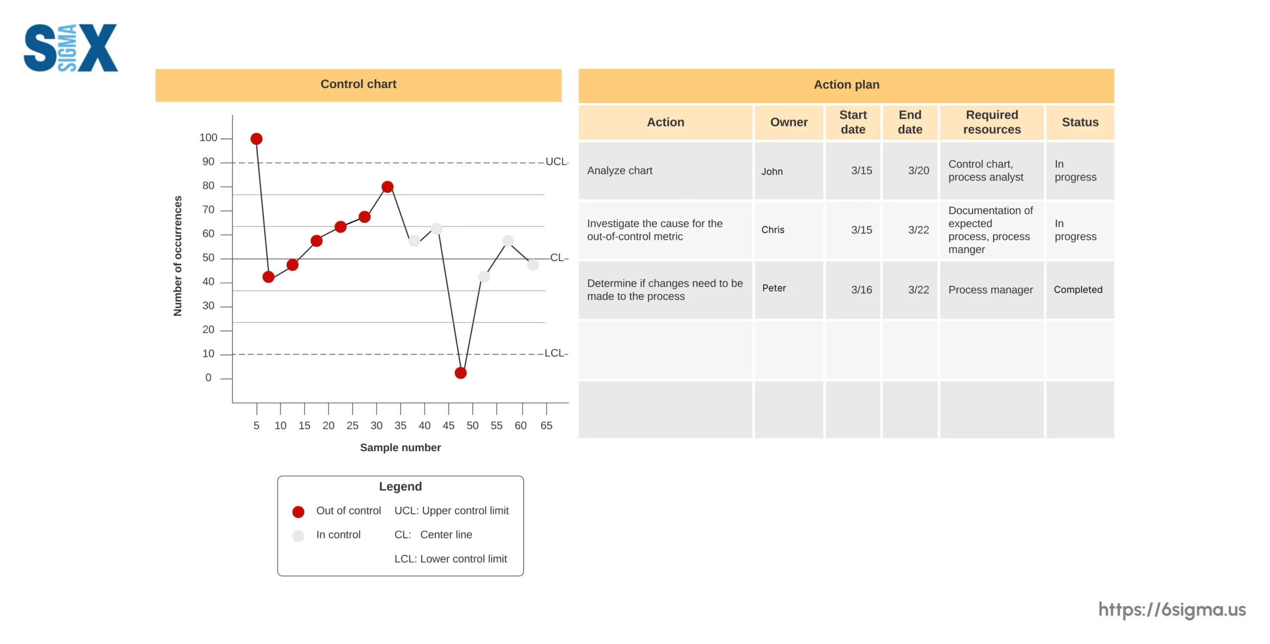
Control charts, also known as Shewhart charts, are powerful statistical tools used for monitoring and analyzing process performance over time.
Named after Walter A. Shewhart, a pioneer in the field of statistical quality control, these charts are designed to help organizations determine whether a process is stable and predictable, or if it is subject to undesirable variations that require intervention.
The primary purpose of control charts is to enable organizations to practice statistical process control (SPC), which involves monitoring and controlling a process to ensure that it operates within predetermined statistical limits.
Components of a control charts
A typical control chart consists of the following key components:
- Control Limits
- Center Line (Mean)
- Data Points
How to create and interpret control charts
Creating and interpreting control charts involves the following steps:
- Collect data: Gather relevant data on the process characteristic or quality metric you wish to monitor, ensuring that the data is representative and collected under stable conditions.
- Calculate control limits and center line: Using statistical methods (e.g., X-bar and R charts, individuals, and moving range charts), calculate the upper and lower control limits, as well as the center line (mean) for the process characteristic.
- Plot data points: Plot the collected data points or subgroup averages on the control chart, positioning them relative to the control limits and center line.
- Interpret patterns and signals: Analyze the control chart for patterns or signals that indicate potential issues or variations in the process. Common signals include points outside the control limits, runs above or below the center line, or unusual patterns or trends.
- Investigate and take action: When signals or patterns indicate a potential issue, investigate the root causes and take appropriate corrective actions to bring the process back within control limits and ensure consistent performance.
4. Histogram
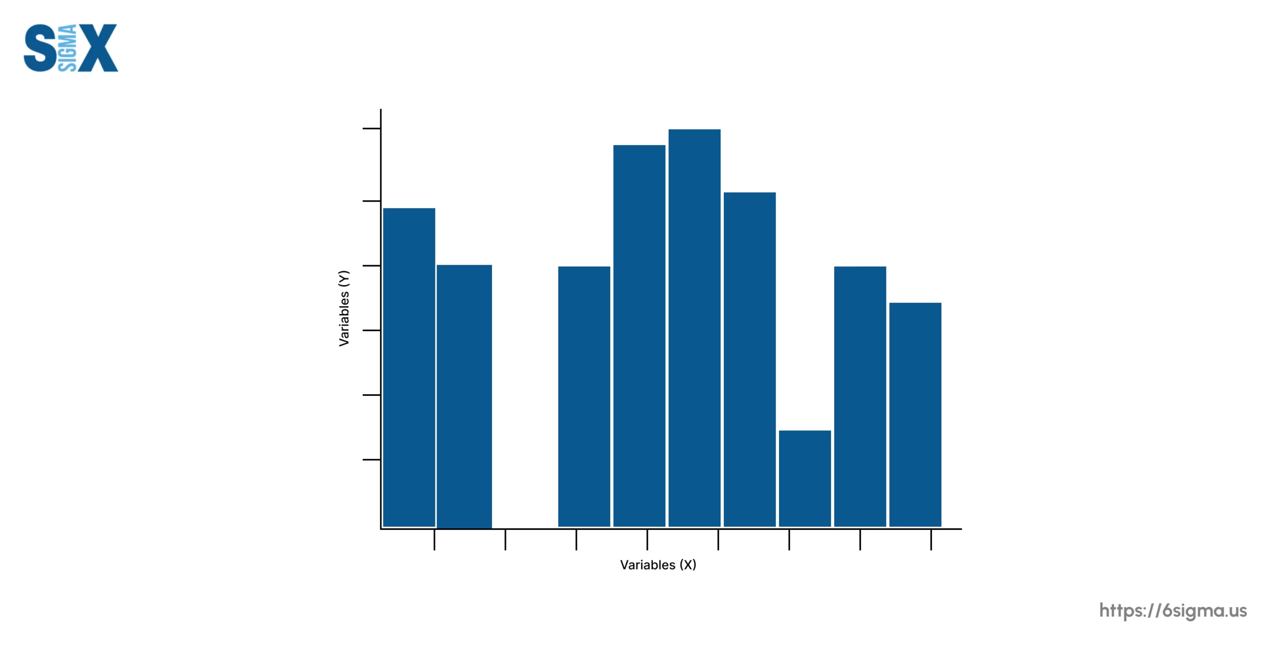
A histogram is a powerful data visualization tool that graphically represents the frequency distribution of a set of data.
It is a type of bar chart that displays the number of occurrences or observations within specific ranges or intervals, providing a clear visual representation of how data is distributed.
How to create and interpret histograms
Creating and interpreting histograms involves the following steps:
- Collect data: Gather the relevant data that you wish to analyze and visualize.
- Determine bin ranges: Divide the range of data into intervals or “bins” of equal width, ensuring that each data point falls into one of the defined bins.
- Calculate frequencies: Count the number of data points that fall into each bin, representing the frequency of occurrences within that range.
- Construct the histogram: Plot the bins on the horizontal axis and the corresponding frequencies on the vertical axis, creating a bar for each bin with a height proportional to its frequency.
- Analyze the distribution: Interpret the shape, center, and spread of the distribution by observing the patterns and characteristics displayed in the histogram, such as skewness, modality, and outliers.
5. Pareto Chart
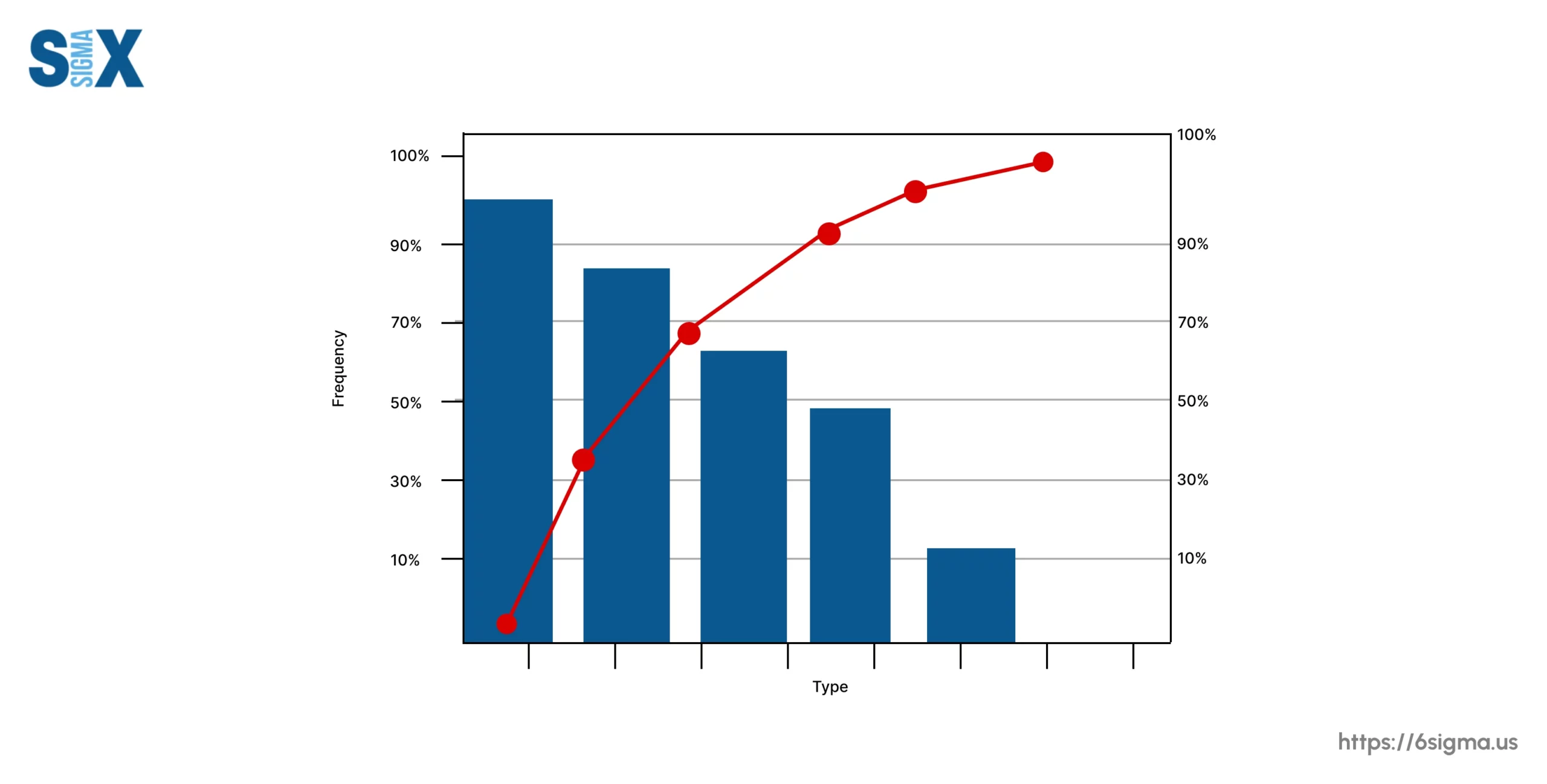
The Pareto chart, named after the Italian economist Vilfredo Pareto, is a powerful tool that helps organizations prioritize issues or factors based on their relative importance or impact.
It is based on the Pareto principle, also known as the 80/20 rule, which suggests that a majority of consequences (typically around 80%) are often influenced by a minority of causes (approximately 20%).
How to create and interpret Pareto charts
Creating and interpreting Pareto charts involves the following steps:
- Collect data: Gather data on the various factors or issues you wish to analyze, such as defect types, causes of customer complaints, or sources of waste.
- Categorize and rank data: Categorize the data into logical groups or factors, and rank them in descending order based on their frequency, impact, or importance.
- Construct the Pareto chart: On the left vertical axis, plot the frequency or impact of each factor using bars, arranged in descending order from left to right. On the right vertical axis, plot the cumulative percentage represented by a line graph.
- Identify the “vital few”: Analyze the chart to identify the factors or issues that contribute to a significant portion of the overall problem or outcome, typically around 80% or more. These are considered the “vital few” that should be prioritized.
- Prioritize and take action: Based on the identified vital few factors, prioritize and implement targeted improvement efforts or corrective actions to address the most significant contributors to the problem.
6. Scatter Diagram
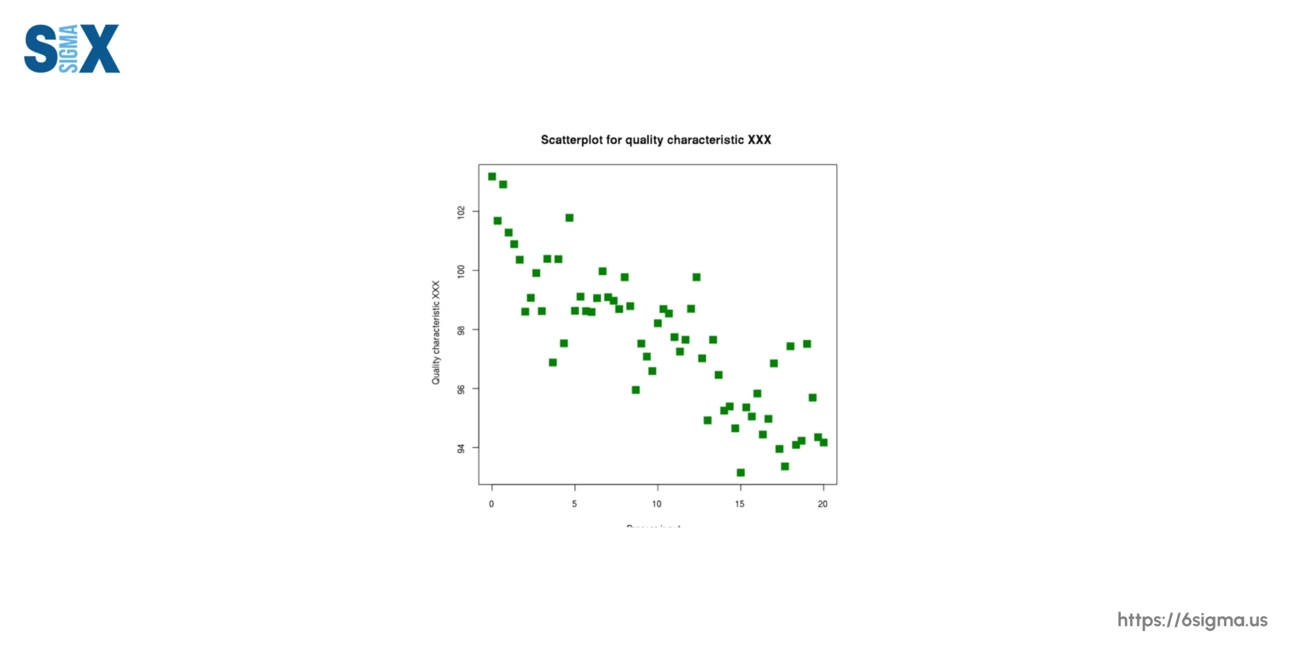
A scatter diagram, also known as a scatter plot, is a graphical tool used to analyze and visualize the relationship between two variables.
It plots pairs of numerical data, with one variable represented on the horizontal (x) axis and the other variable on the vertical (y) axis, forming a collection of data points.
The primary purpose of a scatter diagram is to identify and understand the nature and strength of the relationship between two variables.
How to create and interpret scatter diagrams
Creating and interpreting scatter diagrams involves the following steps:
- Identify variables: Select the two variables you wish to analyze for potential relationships, typically an independent variable (x-axis) and a dependent variable (y-axis).
- Collect data: Gather pairs of data points representing the values of the two variables.
- Plot data points: On a coordinate plane, plot each pair of data points by representing the independent variable’s value on the x-axis and the dependent variable’s value on the y-axis.
- Analyze the pattern: Observe the pattern formed by the data points on the scatter diagram to identify the nature and strength of the relationship between the two variables:
- Positive correlation: Data points form an upward-sloping pattern, indicating that as one variable increases, the other tends to increase as well.
- Negative correlation: Data points form a downward-sloping pattern, indicating that as one variable increases, the other tends to decrease.
- No correlation: Data points are randomly scattered, indicating no apparent relationship between the variables.
7. Stratification (Flowchart, Run Chart)
Stratification, also known as a flowchart or run chart, is a quality control tool used to categorize and visually represent data or process steps in a structured manner.
It involves dividing or grouping data into distinct categories or strata based on specific characteristics or factors, enabling organizations to identify patterns, trends, or potential areas for improvement within each stratum.
The primary purpose of stratification is to enhance process understanding by revealing insights that may be obscured when data is analyzed as a whole.
How to create and use stratification
Creating and using stratification involves the following steps:
- Identify stratification factors: Determine the factors or characteristics that will be used to categorize the data, such as product type, manufacturing shift, supplier, or geographic region.
- Collect and categorize data: Gather relevant data and categorize it based on the identified stratification factors, ensuring that each data point is assigned to the appropriate stratum or category.
- Construct the stratification diagram: Visually represent the categorized data using a flowchart, run chart, or other suitable graphical representation, clearly distinguishing the different strata or categories.
- Analyze within strata: Examine the data within each stratum or category, looking for patterns, trends, or variations that may be specific to that particular group or factor.
- Compare across strata: Compare the patterns and trends observed across different strata to identify potential sources of variation or areas where improvements can be made.
- Implement targeted improvements: Based on the insights gained from the stratification analysis, develop and implement targeted improvement efforts or corrective actions tailored to specific strata or factors.
Integrating the 7 Quality Control Tools
While each of the 7 quality control tools serves a specific purpose, their true power lies in their integrated use for comprehensive problem-solving and process improvement efforts.
By combining the strengths of these tools, organizations can gain a holistic understanding of quality issues, identify root causes, and develop effective solutions.
By integrating the 7 quality control tools into a cohesive problem-solving framework, organizations can leverage their collective power, ensuring a comprehensive and data-driven approach to continuous improvement and quality excellence.
Incorporating the tools into quality management methodologies
The 7 quality control tools have become indispensable components of various quality management methodologies and frameworks, such as Lean, Six Sigma, and Total Quality Management (TQM).
These methodologies provide structured approaches to quality improvement, and the 7 QC tools serve as essential techniques for data collection, analysis, and decision-making within these frameworks.
Professionals with Six Sigma Green Belt certification or Six Sigma Black Belt certifications often master these tools to drive improvements in the DMAIC cycle, ensuring systematic root cause analysis and sustainable results
- Define: Flowcharts and cause-and-effect diagrams can be used to define the problem and identify potential root causes.
- Measure: Check sheets and stratification can be employed to collect and categorize data for analysis.
- Analyze: Histograms, Pareto charts, and scatter diagrams can provide insights into process performance, prioritize issues, and identify relationships between variables.
- Improve: Based on the analysis, targeted improvements can be implemented using the insights gained from the various tools.
- Control: Control charts can be used to monitor process performance and ensure sustained improvements.
Conclusion
These 7 quality control tools / companions emerge as invaluable allies across industries.
Born from Kaoru Ishikawa’s pioneering perceptiveness, they prove themselves repeatedly – empowering problem exposure, unraveling, and solving with sureness and efficiency.
Their true gift lies in simplicity and reach. Distilling statistical quality’s complexities insightfully, these graphical friends democratize quality’s pursuit, including diverse talents in continuous progress coordination.
Individual tools interconnect, a toolkit illuminating root causes, prioritizing concerns, and implementing targeted remedies.
Their integration further strengthens quality systems like Lean, Six Sigma, and Total Quality Management.
Whether a guiding veteran, up-and-coming practitioner, or business leader invested in operational excellence, embrace these seven gifts.
Foster opportunity and culture for constantly honing comprehension. Weave their methods wherever quality presides.
Steered thus, organizations stay on course addressing today’s and tomorrow’s challenges, and leadership in quality for decades ahead.
May shared insights propel all committed to thoughtful cooperation, service improvement and relationships uplifted through challenges met together.
SixSigma.us offers both Live Virtual classes as well as Online Self-Paced training. Most option includes access to the same great Master Black Belt instructors that teach our World Class in-person sessions. Sign-up today!
Virtual Classroom Training Programs Self-Paced Online Training Programs