A Practical Guide to Process Control with Attribute Chart in Six Sigma
How do you effectively monitor processes when your data isn’t a nice, neat measurement like length or temperature?
What happens when you’re dealing with counts – the number of defective items, the proportion of calls meeting a standard, or the occurrences of specific errors?
It’s a critical question, because ignoring this type of data means you’re missing huge opportunities for improvement.
This is precisely where the attribute chart comes into play. It’s one of the fundamental tools in our Six Sigma toolkit, specifically designed for this ‘count’ or ‘attribute’ data.
Understanding attribute charts is non-negotiable if you want to effectively manage and improve many manufacturing and business processes.
In this article, you’ll learn:
- What exactly is an attribute chart and the kind of data it handles?
- The different types: p, np, c, and u charts and when to use each.
- A clear guide to choosing the right attributes control chart for your specific situation.
- Steps for building and, crucially, reading the signals your chart is giving you.
- Seeing attribute chart examples in action.
- Learning from mistakes I’ve seen others make, so you don’t have to repeat them.
My goal here isn’t just to give you definitions; it’s to equip you with the practical knowledge and confidence to select, use, and interpret the correct attribute chart effectively in your own projects.
Think of this as your go-to resource for turning confusing defect data into actionable process insights. Let’s dive in.
Why Attribute Charts are an Essential Tool
You’ve got your process, you know improvement is needed, but what do you do when the critical quality characteristics you need to track aren’t measurements like length or time, but rather counts – pass/fail results, the number of errors on a form, or the percentage of calls meeting a standard?
Struggling to visualize variation when dealing with ‘good/bad’ or defect counts in your process? You’re definitely not alone. This is a very common scenario, and trying to force measurement-based tools onto count-based data just doesn’t work effectively.
This is exactly why the attribute chart exists and why it’s such a cornerstone of the Six Sigma toolkit, especially when you hit the Measure and Control phases of DMAIC. These charts are specifically designed to bring clarity to variation within processes based on attribute data.
What Are Attribute Charts? Understanding the Fundamentals
Simply put, an attribute chart is a specific type of control chart designed to monitor processes where the output quality is measured by counting something – either the number of defective units (like rejects) or the number of individual defects (like scratches or errors) on a unit.
Think of it as the statistical microscope for your process’s pass/fail or count-based performance.
These control charts for attributes are fundamental tools for visualizing variation over time, helping us understand if our process is stable and predictable, or if something significant has changed that needs investigation.
Their core objective is to help us manage and improve those defect or defective rates.
Now, there’s a critical distinction we absolutely must understand: the difference between attribute data and variable data.
Defining Attribute Data vs. Variable Data
Attribute data is information that you count. It’s discrete. It falls into categories. Examples are everywhere: the number of errors on an invoice, whether a soldered joint passed or failed inspection (yes/no), the count of customer complaints per week, or the number of blemishes on a finished product. You’re essentially classifying items or counting occurrences.
Variable data, on the other hand, is information that you measure on a continuous scale. Think of things like cycle time in minutes, the diameter of a part in millimeters, the temperature of a reaction, or the tensile strength of a material. There are theoretically infinite possible values between any two points.
Why does this distinction matter so much?
Because the statistical methods underlying the charts are different! You can’t use a variable control chart, like an Xbar-R (or X̄) chart which looks at averages and ranges of measurements, to monitor the proportion of defective items. The math just doesn’t work.
Choosing the right chart starts with correctly identifying your data type. If you’re counting, you need an attribute control chart. If you’re measuring, you need a variable control chart.
Here’s a simple side-by-side table comparing Attribute Data and Variable Data characteristics:
| Characteristic | Attribute Data | Variable Data |
|---|---|---|
| Type | Counted | Measured |
| Nature | Discrete | Continuous |
| Data Format | Categories | Numerical scale |
| Precision | Less precise (e.g., binary or counts) | More precise (exact measurements) |
| Examples | # of defects, Pass/Fail, Good/Bad, Yes/No | Length, Time, Temperature, Weight |
Master the DMAIC roadmap learn to analyze different data types effectively.
Gain proficiency in statistical tools, including charts, to drive process improvement projects.

Core Objectives of Using Attribute Charts
Okay, so we use an attribute chart for count data. But what are we trying to achieve? What are the objectives? Primarily, these charts help us achieve process stability.
Here’s what that means in practice:
- Monitor the Process Average: Track the central tendency of your defect or defective rate over time. Is the average number of errors per form staying consistent?
- Monitor Process Variation: Understand the natural, inherent variation in that rate. How much fluctuation is normal for this process?
- Detecting Special Causes: The attribute chart helps us distinguish between normal, random fluctuation (common cause variation) and statistically significant shifts or spikes (special cause variation) that indicate something specific has changed in the process – maybe a new operator, a bad batch of material, or a machine malfunction.
- Signal When Not to Adjust: Just as importantly, a stable attribute control chart tells us when the process is behaving predictably (even if not perfectly). It prevents us from “tampering” or making knee-jerk reactions to normal variation, which often just makes things worse. I’ve seen many well-intentioned efforts backfire because people reacted to common cause noise as if it were a signal.
- Provide a Common Language: The chart becomes an objective, visual way to communicate process performance over time.
The Statistical Foundation: Binomial and Poisson Distributions
Attribute charts rely on two main probability distributions: the Binomial distribution and the Poisson distribution. Which one applies depends on what you’re counting.
- Binomial Distribution: Think about situations where each item you inspect has only two possible outcomes – defective or not defective, pass or fail, yes or no. The binomial distribution helps us model the probability of getting a certain number of ‘defectives’ in a given sample size (n), assuming the probability (p) of any single item being defective is constant. This is the foundation for p-charts and np-charts.
- Poisson Distribution: This distribution comes into play when you’re counting the number of defects within a defined unit or area of opportunity (like defects per square meter of fabric, errors per invoice, or scratches per car door). The Poisson distribution models the probability of a certain number of events (defects) occurring in a fixed interval of time, space, or opportunity, given an average rate (lambda). This underlies c-charts and u-charts.
Think of it this way: Binomial is often like flipping a coin multiple times (pass/fail for the whole coin flip trial), while Poisson is more like counting the number of typos per page in a book (multiple flaws possible on one unit).
Understanding which distribution applies is crucial because it dictates how the control limits for the attribute chart are calculated, defining the expected range of common cause variation.
Decoding the Types of Attribute Chart(s): p, np, c, and u Charts Explained
The next crucial step is knowing which specific attribute chart to use. This isn’t arbitrary; picking the wrong one can lead to incorrect conclusions.
I’ve seen teams spend weeks chasing ghosts because they applied, say, a c chart when they really needed a p chart.
The choice boils down to answering two fundamental questions about your data:
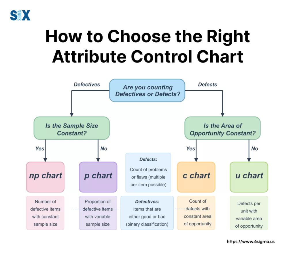
- Are you tracking the number of defective items (entire units classified as bad)? OR Are you counting the number of defects (individual flaws, where one unit might have multiple flaws)?
- Is your sample size (or the area of opportunity you’re inspecting) the same every time you collect data (constant sample size)? OR Does it change from one collection period to the next (variable sample size)?
Based on the answers to these, you’ll land on one of the four primary types of attribute control chart: the p chart, np chart, c chart, or u chart. Let’s break them down.
Tracking Defectives: p-Chart and np-Chart
These first two charts, the p chart and the np chart, are your go-to tools when you’re classifying entire units as either conforming or non-conforming (defective).
You’re making a binary decision for each item inspected – it’s either good, or it’s bad. The key difference between them lies in how they handle sample size.
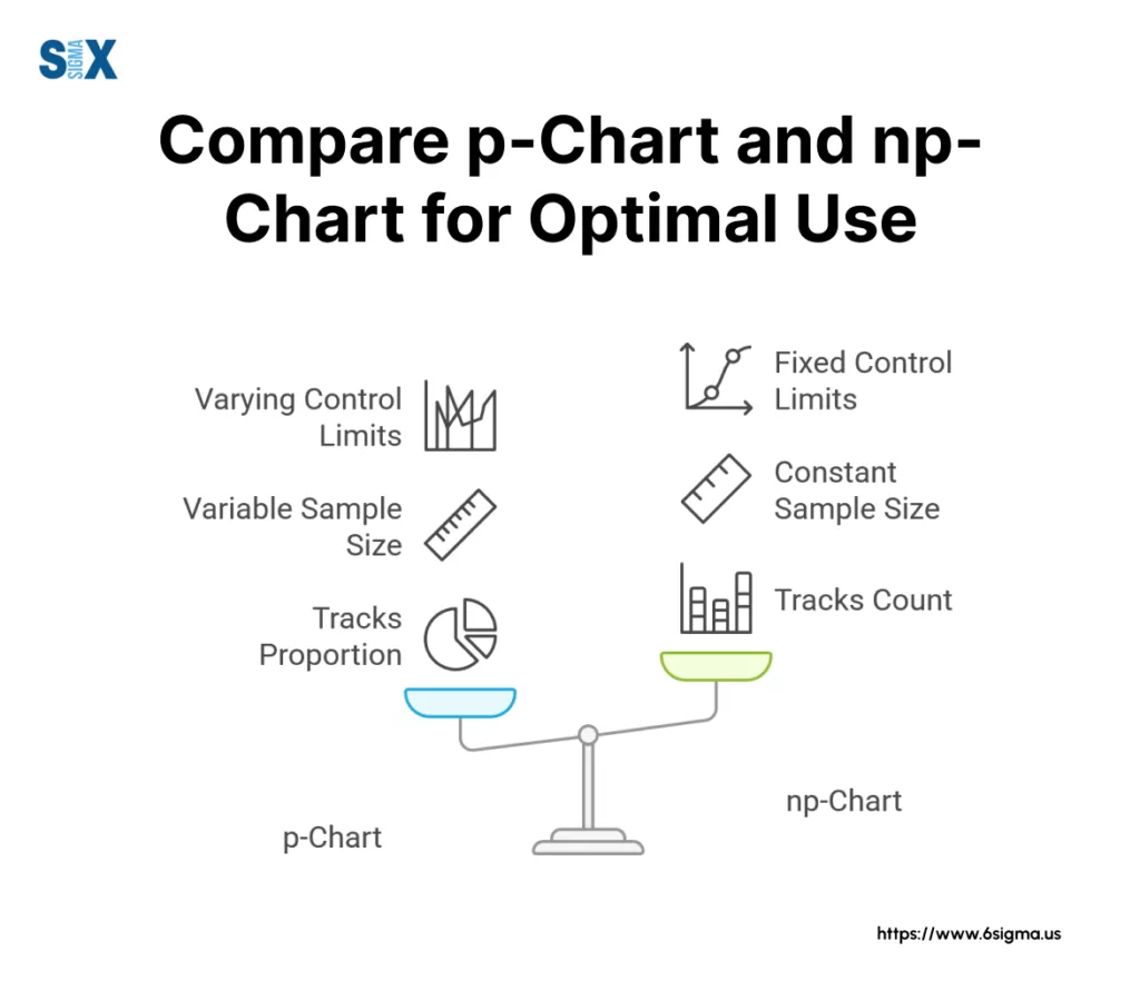
The p Chart (Proportion Defective):
This is probably the most flexible and widely used attributes chart for defective data. The ‘p’ stands for proportion. The p chart tracks the proportion (or percentage) of defective items in each sample or subgroup. Its strength is that it works whether your sample size is constant or variable.
Imagine you’re inspecting outgoing customer orders each day. If the number of orders shipped varies daily (a variable sample size), but you want to track the percentage of orders with errors, the p chart is your tool.
The proportion is calculated as the number defective (np) divided by the sample size (n) for that period (p = np/n).
The trade-off for this flexibility? The control limits on the p chart will actually change whenever the sample size changes, which can sometimes make visual interpretation a bit trickier compared to charts with fixed limits. Still, for variable sample sizes, it’s the standard.
The np Chart (Number Defective):
The np chart, on the other hand, directly tracks the raw count of defective items in each subgroup. It’s often more intuitive for teams to understand – “We had 5 defective units today” rather than “We had a defective proportion of 0.10 today.”
However, the np chart has one strict requirement: it only works when you have a constant sample size for every subgroup. If you are inspecting exactly 100 units from the production line every single shift, and you want to plot the number of rejects found each time, the np chart is perfect.
Its advantage is simplicity in plotting and interpretation due to the fixed control limits (since ‘n’ is constant). The obvious disadvantage is its inflexibility – if your sample size fluctuates, you can’t use it accurately. A classic attribute control chart example for an np chart might be tracking the number of cracked phone screens found in inspected batches of exactly 500 phones.
Counting Defects: c-Chart and u-Chart
What if you’re not classifying the whole unit as defective, but instead counting the number of defects found on a unit or within a defined ‘area of opportunity’?
Think scratches on a car door (one door could have 0, 1, 2, or more scratches), errors on an insurance form, or imperfections per square meter of fabric.
Here, a single unit can have multiple defects. For this scenario, we turn to the c chart and the u chart.
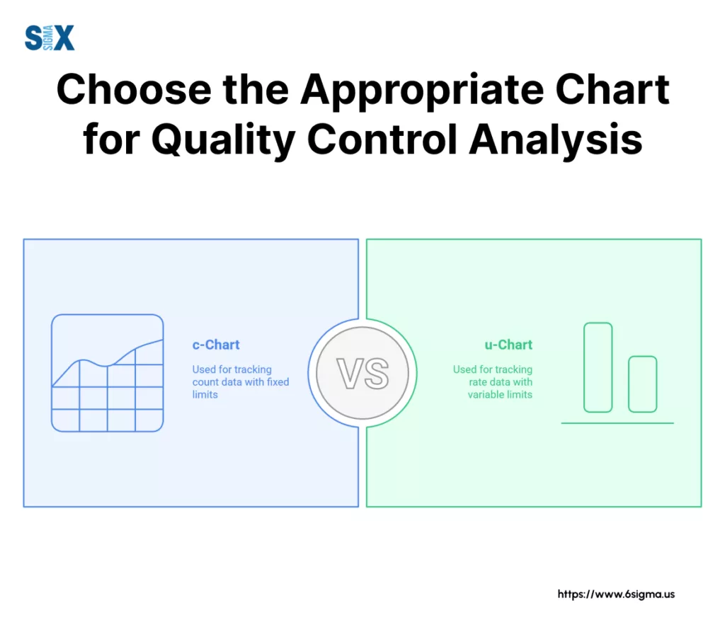
—> The c Chart (Number of Defects):
The c chart is used to monitor the total count of defects found within a defined inspection unit or area, provided that the size or area of opportunity is constant for every unit inspected. The ‘c’ stands for count.
If you inspect the same size circuit board every time and count the number of soldering errors, or review insurance claims forms of the same length and complexity and count the errors on each, the c chart is appropriate. It directly plots the number of defects (c) found.
Like the np-chart, its strength is the intuitive nature of tracking raw counts and having fixed control limits, thanks to the constant sample size (or constant area of opportunity). Its limitation, again, is that requirement for consistency in the unit size being inspected.
—> The u Chart (Defects per Unit):
What happens when the area of opportunity varies? Maybe you’re inspecting different sizes of manufactured panels for surface flaws, or counting software bugs found in code modules of varying lengths?
This is where the u chart comes in. The u chart tracks the rate of defects, specifically the average number of defects per unit (u = c/n, where ‘c’ is the total defects found and ‘n’ is the number of units or the size of the area inspected in that subgroup).
Because it normalizes the defect count into a rate, the u chart can handle both constant sample size and variable sample size situations.
If you count paint blemishes on different car models coming off the line (variable surface area), or track errors per 1,000 lines of code across differently sized software modules, the u chart allows for fair comparison over time. Its flexibility is its power.
The slight downside is that interpreting a rate (e.g., 0.5 defects per unit) might feel less direct initially than a simple count, and like the p-chart, the control limits will vary if the sample size (‘n’) changes.
A good attribute control chart example is tracking non-conformities per standardized inspection area across varying product types.
Gain a solid understanding of the Lean Six Sigma roadmap and essential quality tools.
Selecting the Right Attribute Chart
How do you choose the right attribute chart for your specific situation? Selecting the correct chart is absolutely fundamental.
Using the wrong one will, at best, confuse you and, at worst, lead you to make incorrect decisions about your process. Trust me on this one.
The Key Decision Factors: Data Type and Sample Size
Luckily, selecting attribute chart type isn’t black magic. It boils down to those two key questions we touched upon earlier:
- What kind of data are you counting? Are you classifying entire items as Defective (pass/fail, good/bad)? If yes, you’re in the realm of p chart vs np chart. Or are you counting the Number of Defects or flaws on an item or within an area (where one item can have multiple defects)? If so, you need to consider the c chart vs u chart.
- Is your sample size consistent? For each period you collect data (each shift, day, batch), is the number of items you inspect (your sample size ‘n’) or the area of opportunity constant? Or does it Vary? This determines whether you use an np/c chart (constant size) or a p/u chart (variable or constant size).
It’s easy to get mixed up. I always say: pause and ask yourself clearly, “Am I essentially throwing the whole unit in a ‘bad’ bin if it fails (Defective), or am I counting the individual blemishes or errors on the unit (Defects)?”
Get that straight first, then worry about whether your sample size stays the same each time. Answering those two questions clearly makes selecting attribute chart type straightforward.
A Practical Selection Flowchart/Guide for Attribute Chart(s)
To make selecting attribute chart types even simpler, we can visualize this decision process. Imagine a simple flowchart – it’s a tool I often use in training.
Step 1: Define the Process and Data Collection
Before you collect a single data point, you must be crystal clear about what you’re measuring and how. This sounds basic, but I can’t tell you how many projects I’ve seen stall because of vague definitions.
- Operational Definitions: What constitutes a “defect” or makes a unit “defective”? Be specific! If you’re counting scratches, how long or deep does a scratch need to be to count? Everyone collecting data must use the exact same criteria. Write it down!
- Rational Subgrouping: How will you group your data? Usually, it’s based on time (hourly, daily, weekly) or production batches. The key is that items within a subgroup should have been produced under similar conditions.
- Data Collection Plan: Decide who collects the data, when, where, and how it will be recorded. Consistency is paramount. Aim to collect enough data to get a reliable picture of your process – typically, we recommend at least 20-25 subgroups before you start calculating control limits. Less than that, and your limits might not be very meaningful.
Getting this step right prevents a world of headaches later. Precise definitions and consistent collection are foundational to a useful attribute chart.
Step 2: Calculate the Centerline (Average)
Once you have your initial data (remember, 20-25 subgroups minimum), the next step in the attribute control chart calculation is to determine the process average, which becomes the centerline control chart (CL). This line represents the historical average performance of your process for the metric you’re tracking.
The exact calculation depends on your chosen attribute chart:
- For a p-chart, the centerline (p-bar) is the total number of defective items found across all subgroups divided by the total number of items inspected across all subgroups.
- For an np-chart, the centerline (np-bar) is the total number of defective items divided by the number of subgroups (since ‘n’ is constant).
- For a c-chart, the centerline (c-bar) is the total number of defects counted divided by the number of subgroups.
- For a u-chart, the centerline (u-bar) is the total number of defects counted divided by the total number of inspection units (or total area/opportunity) across all subgroups.
Essentially, you’re calculating the overall average rate or count based on your initial data set. This average forms the central reference line for your attribute chart.
Step 3: Calculate the Control Limits (UCL/LCL)
Now we need to establish the boundaries of expected process variation – the Upper Control Limit (UCL) and Lower Control Limit (LCL). These limits are the voice of the process, telling us what range of fluctuation is statistically ‘normal’ or expected if the process is stable (only subject to common cause variation).
For nearly all standard control charts, including the attribute chart family, these limits are typically set at ±3 standard deviations from the centerline control chart.
Why ±3 standard deviations?
Because if the process is stable and follows the relevant distribution (Binomial or Poisson), there’s approximately a 99.73% probability that any given data point will fall between the UCL LCL limits purely by chance. Points falling outside these limits are statistically unlikely if the process hasn’t changed, signaling a potential special cause.
The specific formulas for the control limits calculation vary for each attribute chart type because they are based on the standard deviation derived from either the Binomial (p, np) or Poisson (c, u) distribution. You can find these formulas in any good Six Sigma textbook or statistical software help file.
Two critical points on control limits calculation for attribute charts:
- Lower Limit Cannot Be Negative: Since you can’t have fewer than zero defects or defectives, if your LCL calculation yields a negative number, you simply set the LCL to 0.
- Variable Limits: For p-charts and u-charts where the sample size (n) can vary between subgroups, the UCL LCL values will actually change for each subgroup based on its specific sample size. Larger sample sizes lead to tighter limits, smaller sizes to wider limits. This is crucial to remember during interpretation! Software handles this automatically, but it’s important conceptually.
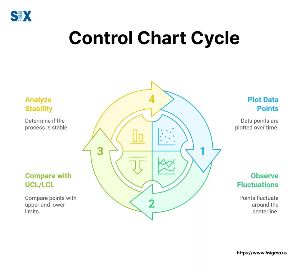
Step 4: Plot the Data and Control Lines
The final step in how to make an attribute chart is visualization. Plot your collected data points (the proportion, count, or rate for each subgroup) sequentially over time on a graph. Draw in the calculated centerline control chart (CL) as a solid horizontal line.
Then, draw the UCL LCL lines, typically as dashed or differently colored horizontal lines above and below the centerline. Remember, for p and u charts with variable ‘n’, these control limit lines might look jagged or step-like rather than straight across.
Make sure your chart is clearly labeled:
- X-axis: Time sequence or subgroup number (e.g., Day, Batch #, Week).
- Y-axis: Your measured metric (e.g., Proportion Defective, Number of Defects, Defects per Unit).
- Clearly label the CL, UCL, and LCL lines with their calculated values.
And there you have it! You’ve successfully constructed your initial attribute chart. The next crucial skill, of course, is learning how to interpret the patterns you see, which we’ll cover next.
Reading the Signals: How to Interpret Attribute Control Charts
Let’s get to arguably the most crucial part of using any attribute chart: understanding what it’s telling you.
This skill separates those who just plot data from those who use charts to drive genuine process improvement. It’s about listening to the voice of your process.
Identifying Statistical Control vs. Out-of-Control Signals
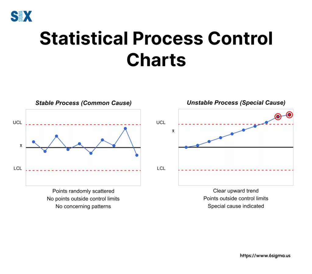
The first thing we look for when interpreting an attribute chart is whether the process is in a state of statistical control. What does that mean?
A process in statistical control exhibits only common cause variation – the natural, inherent, random fluctuation expected within the established control limits.
It’s predictable, even if it’s not perfect. The points bounce around the centerline randomly, mostly near the center, with none triggering any specific warning signals.
Contrast this with out of control signals. These indicate the presence of special cause variation – something specific and assignable has happened to shift the process or increase its variability.
This could be a change in materials, a different operator, a machine setting drift, a new procedure being introduced – something occurred.
An attribute control chart showing out of control signals is unpredictable. Our primary goal when interpreting these charts is to detect these special cause variation signals so we can investigate, find the root cause, and eliminate it to bring the process back into stable, predictable statistical control (and hopefully improve its average performance along the way).
Key Rules for Detecting Special Causes (Control Chart Rules)
How do we spot these special cause variation signals? We use established control chart rules.
While there are several sets (like the full Western Electric or Nelson rules), most practitioners focus on a core set of rules that reliably detect non-random patterns.
Here are the most common ones you absolutely need to know to effectively interpret attribute control chart plots:
- Points Outside Control Limits (Rule 1): This is the most obvious signal. Any single point falling above the Upper Control Limit (UCL) or below the Lower Control Limit (LCL) is a strong indicator of a special cause. Remember that ~99.7% of points should fall within the limits if only common cause variation is present, making an outside point statistically significant.
- Runs (Points on One Side): A long run of consecutive points all falling on the same side of the centerline indicates a potential shift in the process average. Different guidelines exist, but common rules look for 7, 8, or 9 points in a row either all above or all below the centerline.
- Trends (Consistent Direction): Look for a sustained drift in the data. A common rule flags 6 or 7 consecutive points steadily increasing or decreasing. This often suggests a gradual change, like tool wear or a slow shift in material properties. What might a sudden upward trend in defects indicate in your process? It definitely warrants investigation!
- Cycles (Repeating Patterns): Does the data show a repeating up-and-down pattern? This cyclical behavior can sometimes point to systematic factors like shift changes, regular maintenance schedules, or differences between suppliers used on rotation.
- (Less Common but useful) Hugging the Centerline (Stratification): If too many points fall very close to the centerline, it might indicate that data from different sources (e.g., different machines or operators) with different averages are being mixed into each subgroup, artificially reducing the variation seen on the chart.
- (Less Common but useful) Points Near Control Limits: Rules like “2 out of 3 consecutive points in Zone A” (Zone A being the area between 2 and 3 standard deviations from the centerline) can provide earlier warnings of potential shifts before a point actually crosses the limit.
Learning to spot these non-random patterns defined by the control chart rules is key to unlocking the diagnostic power of your attribute chart.
What to Do When a Signal is Detected in the Attribute Chart(s)
Okay, your attribute control chart shows one of these out of control signals. What now? Investigate! This is where the chart directs your problem-solving efforts.
- Investigate Immediately: Don’t wait. Try to identify what was different about the process when that signal occurred. Talk to operators, check logs, examine materials related to that specific time period or subgroup.
- Use Root Cause Analysis Tools: The chart signals that something happened, but rarely why. This is where tools like the 5 Whys or a Fishbone (Ishikawa) diagram come in handy to dig down to the underlying root cause of the special cause variation. (You can learn more about Root Cause Analysis here.)
- Implement Corrective/Preventive Actions: Once the root cause is identified, implement actions to fix it and, importantly, prevent it from recurring.
- Document Everything: Keep records of the signal, the investigation, the findings, and the actions taken. This builds process knowledge.
- Consider Recalculating Limits (Carefully): After you’ve identified and eliminated a special cause and have data showing the process is stable again under the new conditions, you might recalculate your control limits based on the more recent, representative data. Don’t just exclude points without understanding and addressing the cause!
Don’t ignore the signals your attribute chart is giving you! They are opportunities to learn and improve.
Attribute Chart Examples & Applications
I find that walking through concrete attribute chart examples is one of the best ways to solidify understanding.
So, let’s look at how different types of attribute charts are applied in various scenarios, moving beyond just manufacturing, as these tools are incredibly versatile across industries.
Example 1: p-Chart for Call Center Service Levels
Imagine a call center manager wanting to track the daily performance against a key service level agreement (SLA) – say, resolving customer issues on the first call.
The number of calls handled each day naturally fluctuates (a variable sample size). They classify each call as either meeting the first-call resolution standard (conforming) or not (non-conforming, or ‘defective’ in this context).
- Why p-Chart? Because they are tracking the proportion of defective calls (failed first-call resolution), and the sample size (total calls) varies daily.
- The p chart example would plot the percentage of calls failing the standard each day. An upward trend might signal a need for retraining, while a sudden spike could indicate a system outage or a particularly complex issue affecting many calls. The p chart example provides insights into overall service consistency despite varying call volumes. This is a classic service industry attribute control chart example.
Example 2: np-Chart for Manufacturing Batch Acceptance
Consider an electronics manufacturer inspecting fixed-size batches of circuit boards – say, exactly 100 boards per batch – before shipping. They are interested in the number of boards in each batch that fail a final functional test (making the whole board ‘defective’).
- Why np-Chart? They are counting the number of defective units, and the sample size is constant (always 100 boards).
- The np chart example would plot the raw count of failed boards for each batch. If the chart shows stability around, say, an average of 2 failed boards per batch, but then suddenly jumps to 10 for several batches, it’s a clear signal. This np chart example helps quickly identify batches with unusually high failure counts, prompting investigation into potential issues with components or assembly processes specific to those batches.
Example 3: c-Chart for Software Code Review
Let’s move to software development. A team performs code reviews on submitted modules, counting the number of coding standard violations (defects) found in each module.
For this specific project, let’s assume all modules being reviewed are roughly the same size and complexity, representing a constant area of opportunity for defects.
- Why c-Chart? They are counting the number of defects (violations) per inspection unit (module), and the area of opportunity is considered constant.
- The c chart example plots the total count of violations per module. Stability might show an average of 3 violations per module. A point spiking to 15, or a downward trend after implementing new automated checking tools, would be clearly visible. This c chart example helps track the effectiveness of coding practices and review processes.
Example 4: u-Chart for Hospital Patient Safety Incidents
In a healthcare setting, a hospital wants to monitor the rate of medication errors. They count the total number of errors occurring each month.
However, the number of patients, and therefore the number of opportunities for error (often tracked as ‘patient days’), varies significantly from month to month (variable sample size or area of opportunity).
- Why u-Chart? They are counting the number of defects (errors), but the area of opportunity (patient days) varies. The u-chart calculates the rate of errors per, say, 1000 patient days.
- The u chart example would plot this error rate monthly. This allows for fair comparison across months with different patient loads. An upward shift on the u chart example (even if the raw number of errors didn’t look alarming in a busy month) would signal a statistically significant increase in the error rate, prompting investigation into potential systemic issues in medication administration processes. This is a powerful attribute control chart example in a critical service environment.
These attribute chart examples illustrate how the simple logic of choosing based on data type (defectives vs. defects) and sample size (constant vs. variable) applies across diverse fields. Each attribute chart provides a unique lens for viewing process performance and stability.
Common Mistakes When Using Attribute Charts
I’ve seen recurring attribute chart mistakes that can undermine your efforts. Let’s talk about these control chart pitfalls so you can avoid them. Forewarned is forearmed, right?
Perhaps the most frequent error, as we discussed earlier, is simply choosing the wrong chart type. Using a p-chart when you have constant sample size defect counts (an np-chart job) or a c-chart for variable areas of opportunity (where a u-chart is needed) leads to incorrect limits and flawed conclusions.
Another one of the common errors control charts suffer from is building them with insufficient data. Calculating limits based on just a handful of subgroups gives you unstable, unreliable limits.
Remember that baseline of 20-25 subgroups before you draw those lines! Equally problematic are poor operational definitions. If different people count defects differently, your data is inconsistent, making your attribute chart meaningless garbage-in, garbage-out.
Then there’s the management of the limits themselves. A frequent mistake is not recalculating control limits after you’ve made a significant process improvement or identified and removed a special cause.
Your process has changed; your limits should reflect the new reality. Conversely, people sometimes overreact to common cause variation, tweaking the process based on normal random fluctuations – we call this tampering, and it usually increases variability! At the same time, don’t make the opposite mistake of ignoring clear out-of-control signals; those are your calls to action.
Crucially, never confuse control limits with specification limits. Control limits tell you what the process is doing (its natural variation), while specification limits tell you what you want it to do (customer requirements).
A process can be in perfect statistical control but still produce output outside of specifications! Finally, remember that an attribute chart isn’t typically a one-off analysis; its real power comes from continuous monitoring to maintain gains and detect new shifts.
So, take a moment and review your last control chart project. Did you fall into any of these traps? Being aware of these common attribute chart mistakes is the first step toward using these charts correctly and effectively.
Attribute Charts vs. Variable Charts: When to Use Which
We established this early on, but it bears repeating: the fundamental choice between attribute vs variable control charts hinges entirely on your data type. If you’re counting defects or defectives (attribute data), you use an attribute chart (p, np, c, u).
If you’re measuring something on a continuous scale (variable data), you’ll need variable control charts like Xbar-R, Xbar-S, or I-MR charts. Knowing which path to take is step one in any control charting exercise.
Integrating Charts with Other Six Sigma Tools
Remember, an attribute chart rarely works in isolation. It’s a vital part of the broader toolkit, especially within the DMAIC framework. In the Measure phase, it helps baseline performance. In the Control phase, it ensures improvements hold.
When your chart signals a special cause, you don’t just stop there! You integrate it with other six sigma tools. Use a Pareto chart to prioritize which defects (if using a c or u chart) to focus on, employ a Fishbone diagram or 5 Whys for root cause analysis, and potentially even perform Process Capability analysis specifically for attribute data (Binomial or Poisson capability) to see how your process performs relative to requirements. The attribute chart often points you where to dig deeper.
Software for Creating Attribute Charts
While you can construct basic attribute charts by hand or in Excel (especially with templates), specialized statistical software makes the job much easier and more robust.
Packages like Minitab or dedicated Excel add-ins like SigmaXL handle the calculations (including those tricky variable control limits for p and u charts) and complex rule checking automatically.
Using tools like Minitab attribute charts functionality allows you to focus more on interpretation and less on the mechanics of calculation, which is a huge benefit in project work.
Exploring these areas can further enhance how you leverage the power of the basic attribute chart in your improvement efforts.
Avoid common pitfalls by mastering the complete DMAIC methodology
Learn to select appropriate projects and confidently mobilize teams using proven techniques with Green Belt Training.
Take Control of Your Process with Attribute Charts
Correctly using an attribute chart allows you to visualize process stability, detect statistically significant changes (those special causes!), and ultimately gain crucial insights into your defect or defective rates.
Mastering these charts empowers you, especially as a Green Belt, to move beyond guesswork and make data-driven decisions for effective process control six sigma.
It’s about reducing waste, improving quality, and achieving sustainable results. Don’t underestimate the clarity these simple-looking charts can bring.
SixSigma.us offers both Live Virtual classes as well as Online Self-Paced training. Most option includes access to the same great Master Black Belt instructors that teach our World Class in-person sessions. Sign-up today!
Virtual Classroom Training Programs Self-Paced Online Training Programs